Archives for March 2019

How Do I Write Great Copy For My Website?

Your homepage may not have a lot of text on it. Perhaps, like some of the site examples in the last unit, it only contains your tagline and your elevator speech. But your other site pages may have a page or two full of text.

So how can you present all your information, without losing your reader’s attention? And how do you snag people in to get them to start reading and then keep reading?

There are a few techniques you can use to present your words in a way that attract and hold attention. First, let’s look at the way your words appear on the page.

On the Internet, there are readers (who actually read, in order, what you’ve written) and scanners (skim-readers), so you want to write for both. You can do this by either:

  • Highlighting key pieces of your text to jump out at the skim-readers.
  • Or you can use sub-headings to break up your copy, yet still convey the gist or idea of what you’re saying.
  • Or you can use the sub-headings as a hook to pull them in and make them read more.

Let’s look at each technique.

Highlight Text To Pull Attention

You can test whether you’ve highlighted the right parts of your text, by ONLY reading the highlighted text and see if you’ve pretty much got your message conveyed. And I’m going to give you a real life example of this soon.

You can highlight using bold, or a different color text, or an actual background highlight. Use the highlight that fits with the style of your site. Note: Yes, you could also use italics, but you would need to use them sparingly as italics can be more difficult and tedious to read – depending on the font you have chosen.

You also want to break your text up into smaller paragraphs, as it’s hard to read a big chunk of text online. But, it is also hard to keep your focus if every paragraph is only one sentence long! So good copy has a mix of both longer and shorter paragraphs.

If you don’t like highlighted text, another way to grab your site visitor’s attention quickly, is to use sub-headings throughout your text.

Sub-Headings Hook The Reader and Summarize Text

The eye will immediately flick to the sub-headings and if they are intriguing, or descriptive in a way that makes the person feel you are talking to them, or funny, or pithy, the site visitor will start reading your text and you have a good chance of hooking them in.

I’m going to demonstrate the power and effect of each of these techniques by giving you an actual example from a live site, so you can learn and also compare.

Take a look at this sample text from Simply Gratitude.

First we have the Rough Version where she has effectively nailed down her content; she has identified her customer, she knows what her business is and what it does, and she is speaking directly to her customer.

But it is still not ready to go live, as it needs this last, final polish that will really engage her site visitor. Read it and think about how you’d give it the final edit to adhere to the two final polishing criteria:

  1. Highlight text for the skim readers. Or use sub-headings.
  2. Vary length of paragraphs and avoid overly large chunks of text

ROUGH VERSION – Simply Gratitude, Corporate Gift Service

Can you remember a time where you were gobsmacked by an unexpected gift?

Take a minute to recall…I’ll give you a moment to reflect.

There are many corporate gift specialists out there and I’m one of them, but what makes Simply Gratitude different is our focus. We work with you to create custom, high-end extraordinary gifts and bring attention to you as a business and use gratitude and thankfulness as the vehicle. It’s one thing to thank a client for contributing to your business by giving them a percentage off the next purchase or adding a dollar amount into their account for referrals. It’s another thing to send them a gift because you believe that they are valuable and want to express that gratitude and thankfulness through the power of a gift.

So let’s go back to the gift you recalled. I’ll bet you can remember the gift down to the details and maybe even who you were with or what was cooking! You may have been 5 years old or a teenager or maybe you never received a gift that had this sort of impact that I’m speaking of. Either way, you have a chance to engage someone in this experience and pay forward the long lasting memories and power that an unexpected gift brings.

Most of us can’t recall what we were given 2 years ago, but an unexpected gift has the power to last for years. Just think about that for a second, you giving to a client/customer can have the power of them remembering you for years!

Simply Gratitude helps gifts become an extension of you and of your business. I ask you to give gratitude, to pay it forward and say thank you just because and do it without expectation because trust me the universe will take care of the rest!

If you as a business say that you value your clients, appreciate them and that you are an extraordinary company then let Simply Gratitude take you further into your commitment of being extraordinary!

***************

Now let’s look at Example #1 to see how I have edited this homepage text to incorporate these two of the final criteria:

  1. Highlight text for the skim readers.
  2. Vary length of paragraphs and avoid overly large chunks of text

EXAMPLE #1 – Use Highlighted Text

Can you remember a time where you were gobsmacked by an unexpected gift?

Take a minute to recall… I’ll give you a moment to reflect.

There are many corporate gift specialists out there and I’m one of them, but what makes Simply Gratitude different is our focus.

We work with you to create custom, high-end, extraordinary gifts and bring attention to you as a business – using gratitude and thankfulness as the vehicle.

It’s one thing to thank a client for contributing to your business by giving them a percentage off their next purchase, or adding a dollar amount into their account for referrals. It’s another thing to send them a gift because you believe that they are valuable and want to express that gratitude and thankfulness through the power of a gift.

So let’s go back to the gift you recalled. I’ll bet you can remember that gift down to the details, and maybe even who you were with, or what was cooking! You may have been 5 years old, or a teenager… or maybe you never received a gift that had this sort of impact that I’m speaking of. Either way, you have a chance to engage someone in this experience and pay forward the long-lasting memories and power that an unexpected gift brings.

Most of us can’t recall what we were given for Christmas or a birthday 2 years ago, but an unexpected gift has the power to last for years. Just think about that for a second: Giving to a client/customer (in the true spirit of gratefulness) can have the power of them remembering you for years!

Simply Gratitude helps gifts become an extension of you and of your business. I ask you to give gratitude, to pay it forward and say thank you ‘just because’ and do it without expectation, because, trust me, the universe will take care of the rest!

If you as a business say that you value your clients, appreciate them and that you are an extraordinary company then let Simply Gratitude take you further into your commitment of being extraordinary!

***************

Remember our trick for testing whether your highlighting works? You read ONLY the highlighted text and see if it alone conveys your message. So take a moment to scan through Example #1 above and read only the highlighted text. See how that works? Pretty cool, eh?

Make sure you always apply this same test to your own highlighted copy.

Of course, it is always your choice how much highlighting you use and what kind of customer you want to attract. You may say, “I don’t want any customers who are scanners, my customer is someone who carefully reads text and doesn’t rush through things – that’s the kind of person I want to attract.”

Or perhaps you yourself do not like highlighted text!

That’s fine and perhaps for that kind of customer, or for your own esthetic sense, you want to use headlines and sub-headings instead of highlighting text. In that case, you would format your text more like this:

EXAMPLE #2 – Use Sub-Headings

Can you remember a time where you were gobsmacked by an unexpected gift?

Take a minute to recall… I’ll give you a moment to reflect.

There are many corporate gift specialists out there and I’m one of them, but what makes Simply Gratitude different is our focus.

The Power of Thankfulness

We work with you to create custom, high-end, extraordinary gifts and bring attention to you as a business – using gratitude and thankfulness as the vehicle.

It’s one thing to thank a client for contributing to your business by giving them a percentage off their next purchase, or adding a dollar amount into their account for referrals. It’s another thing to send them a gift because you believe that they are valuable and want to express that gratitude and thankfulness through the power of a gift.

Pay It Forward

So let’s go back to the gift you recalled. I’ll bet you can remember that gift down to the details, and maybe even who you were with, or what was cooking! You may have been 5 years old, or a teenager… or maybe you never received a gift that had this sort of impact that I’m speaking of. Either way, you have a chance to engage someone in this experience and pay forward the long-lasting memories and power that an unexpected gift brings.

Most of us can’t recall what we were given for Christmas or a birthday 2 years ago, but an unexpected gift has the power to last for years. Just think about that for a second: Giving to a client/customer (in the true spirit of gratefulness) can have the power of them remembering you for years!

Be Extraordinary

Simply Gratitude helps gifts become an extension of you and of your business. I ask you to give gratitude, to pay it forward and say thank you ‘just because’ and do it without expectation, because, trust me, the universe will take care of the rest!

If you as a business say that you value your clients, appreciate them and that you are an extraordinary company then let Simply Gratitude take you further into your commitment of being extraordinary!

***************

Again, using the same scan test you used with the highlighted text in Example #1, you can see that these sub-headings – although not as effective or comprehensive as highlighted text – still manage to convey the broad strokes of the message. And hopefully they are intriguing, or eye-catching enough to make the reader want to read more.

Use whichever style of emphasis you prefer. It is easier to figure out which text to highlight, or how to divide up your text and give it sub-heads if you let your copy sit for a few days, then you can look at it again with fresh eyes.

Alternatively, you can give it to a friend or family member and see what they come up with – never underestimate the value of fresh eyes!

You may have noticed that throughout this Listen To Your Freedom program, I have used both sub-headings and highlighted text (in bold). When you have a full page or more of copy, you can certainly use both techniques without it being overkill.

Remember, your goal is to make reading, understanding and implementing easier for the reader – so just make sure whatever you do achieves that goal.

Attention-Grabbing Headlines

If writing doesn’t come naturally to you, how do you come up with a call-to-action that makes people actually take the action you want (sign-up, or click the link, etc.).

How do you write a blog post title that makes someone want to click on it and read more? How do you title your YouTube video to make it stand out among all the others? And how do you craft a headline for your opt-in offer that makes people want to sign up immediately?

Well, you set yourself to some swiping, that’s how! You copy or borrow techniques from proven copywriters and then just tailor them to your content. Here are some easy ways to come up with attention-pulling headlines or titles that are proven (in multiple split-tests) to produce good response from viewers.

Most copywriting courses train you to use what they call Power Words. These are words that are active, wow language, bold, audacious words or claims that pack a punch. The reasoning is that these words jump out and grab the reader.

But personally, I think copy and headlines like this are a turn-off, as they make me think the person is a scammer or a knucklehead:

Slam Your Ideas Home With This Incredible Opportunity To Annihilate Your Rivals

Power copywriting like that just doesn’t appeal to me. But I think there are markets where it would be appealing – like bodybuilding, wrestling, or extreme sports, for example.

Jini’s Copywriting Tips & Tricks

For the rest of us, we should just try to use words that carry a bit more energy or sparkle than regular words, like these:

  • Effortless
  • Painstaking
  • Fun
  • Free
  • Incredible
  • Essential
  • Absolute
  • Strange
  • Sparkling
  • Strident
  • Audacious
  • Fantastic
  • Bizarre
  • Magnificent
  • Luscious
  • Fabulous
  • Crazy
  • Striking
  • Powerful
    etc.

You can then take these words, or any other adjective, and combine one or two of these words with any of the techniques below:

Use a number in your headline:

5 Fun Ways To …

The 10 Top…

7 Crazy Reasons…

3 Great Ideas To…

8 Secrets Of…

Give a list – people love lists!

The Top Reasons…

Octogenarians Share Their Top Life Lessons…

Spring Decorating Ideas…

Combine techniques: Of course, these two techniques – numbers and lists – also combine well together. Simply put a number with any of these words to form your headline:

  • Tricks
  • Lessons
  • Ideas
  • Ways
  • Items
  • Principles
  • Facts
  • Reasons
  • Secrets

Examples:

10 Tricks To Beat Winter’s…

21 Ways to…

7 Secrets of…

The Secret to Getting (Making/Planning/Having/Avoiding)…

Ask a question: these trigger people to think about the question and answer it in their head, then they want to find out the ‘real’ answer.

What are…?

How can…?

What does…?

When is…?

Who is/are…?

Where is..?

Where can…?

Where do…?

Find out why…

Use the fear factor: People are always interested in how to avoid mistakes or disaster.

Top 10 mistakes…

5 Things You Never Want To Do When…

How To Avoid…

How to Never…

Make Sure You Don’t Get…

Compare items: People love comparisons, especially when they’re doing research.

X versus Y…

See Which Car Rules – X or Y?

Battle of Titans – X vs Y

Which One Scored Higher – X or Y?

Survey Ranks X Above Y

Use a trigger word: these are used to encourage, persuade or enable someone

How to…

Why…

When…

What…

I have to admit, my favorite headline or titling technique is “How To… ” perhaps because I do a lot of teaching.

Headline Formula

You can also use whichever techniques or words given above that appeal to you and combine them using this formula:

Number + Adjective + Keyword or Subject + Promise

Examples:
10 (Number)
+ Audacious (Adjective)
+ Ways to Decorate Your Party (Subject)
+ In Less Than One Hour (Promise)
= 10 Audacious Ways to Decorate Your Party In Less Than One Hour

7 Effortless Ways To Sell Your Car in One Week

3 Bizarre Ways You Can Double Your Revenue By Spending Less


Okay, that should give you some good ideas whenever you’re stumped.

Pressie Time!

Woohoo! Time for another gift! While we’re at it, let’s take a moment to offer gratitude for this amazing journey we are on together. Isn’t this awesome? Aren’t you learning SO much? Are you excited about your future? I am!

So I turned these Copywriting Tips & Tricks into a well cool PDF you can download and then pin near your computer for easy brainstorming whenever you need to think up a title for a blog post, a heading or sub-heading, the name of a new product or program, a title for your latest video, etc. Enjoy!

DOWNLOAD Jini’s Copywriting Tips & Tricks


Now that I’ve given you all the how-to and lots and lots of examples, it’s your turn to get your pen and paper and turn all this new knowledge into some fantastic stuff for your website!


Use Jini’s Copywriting Tips & Tricks (did you download it and print it out?) to come up with some blog post titles that your people would nd eye-catching or interesting (do at least 5):


Now take the copy you came up with for your ABOUT page and use Jini’s Copywriting Tips & Tricks to add sub-headings before each section. Maybe you also want to add a headline at the very top? You can either work in Microsoft Word, print it out and glue it here, or work right on the page here:


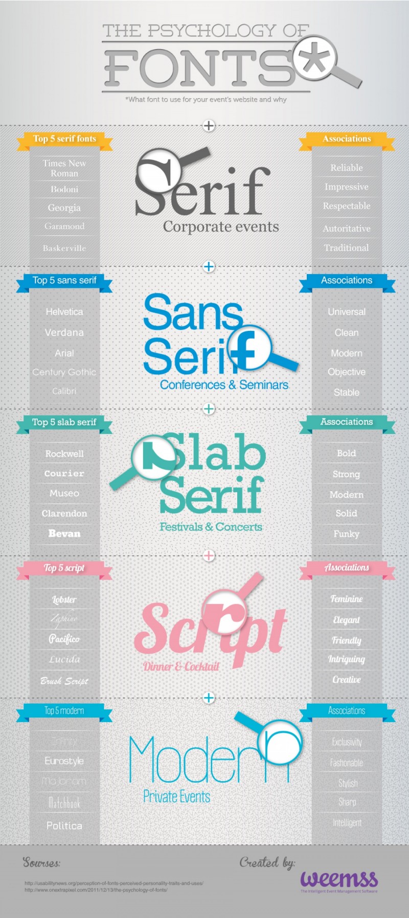
And lastly, now that you have all this great website copy written, how do you choose a font (style of lettering) for your site text, headings, etc? Here’s a nifty infographic that will help you decide:

How Do I Design a Good Homepage?

Let’s map out your homepage for your new site, using all the principles from LTYF. You should already have your website colors picked out and the look and feel of your site established. You  have a good idea of what service(s) or product(s) you want to offer. Even better, you should have have put some thought into how you want to organize your site content, which will really help with this next step.

Now you need to nail down:

  • How do you want visitors to travel through your site? What’s the first thing you want their eye to focus on, then where do you want them to look, then what do you want them to click on, etc.
  • What do you want to offer them?
  • What problems are you going to solve?

Remember that people rarely purchase the first time they land on your site. So do not make the purpose of your homepage a quick sale! You need to build a relationship with your site visitor first, you need to give them some stuff for free and earn their trust. THEN they will buy from you.

So keep this in mind when planning your homepage: How can I get a site visitor to begin a relationship with me?

Perhaps everything on your homepage is geared towards getting them to sign-up for your fantastic free item. Remember, once you have their email, you can start building a really solid, long-term relationship with them.

Perhaps you want to point them to a few items (videos, blog posts, or downloads) that you know are amazing and will really speak to them and then at various points provide the opportunity to sign-up to your list.

If you’re just starting out and you don’t have a lot of content, then you really want to push your sign-up offer – because it’s unlikely that person will find their way to your site again otherwise. We’ll go into sign-up and opt-in offers in detail in the next module. For now, just leave space for a (roughly) 2-inch sign-up box in your page design.

You can either write out your plan for your homepage (and the other pages on your site), or, if you are primarily visual, then sketch out your homepage. Or do both!

You can also use a free template site design tool like FrameBox, SimpleDiagrams or iWeb to map out your homepage. Here’s what FrameBox looks like – it’s very easy to use, just drag and drop:

This enables you to play around with your ideas and be able to see what they would actually look like on a webpage. Then you can either scan your sketch or take a screenshot (picture) of your homepage design and send it to your programmer to help communicate your ideas. In case you don’t know how to take a screenshot (a photo of what’s on your computer screen), here’s my video that shows you how:

Another super-easy, free online drawing tool you can use to sketch out your site, or create charts or infographics for your stuff is Google Drawing. Here’s my video where I show you how easy and fun it is to use Google Drawing:

Keep in mind, that sketching out your site design does not have to be complicated! Here’s what I sent to my programmer for an earlier homepage of Listen To Your Freedom. You can just sketch it out freehand on a piece of paper and use your phone to take a photo of it  – then email the jpg photo to your programmer! I added other details and refinements after my programmer made this basic layout live on the site – once I could see/feel how everything looked:

You see where I’ve drawn a dotted line and marked that FOLD – that shows what I want to have appear on the screen when people come to my homepage, without having to scroll down. Everything above the fold line is what shows when your site opens up in a laptop window and everything below the fold will require scrolling down to see. If someone has a larger desktop computer, they may see more above the fold. Note: You may have to explain this to your programmer, especially if English is not their first language.

And here’s what that simple sketch turned into (after about 15 emails back and forth – cause I’m just that picky!):

You’ll see how this homepage contains a headline, my tagline, the video presents my benefits and shows I understand my customer, the stickmen are targeted to my top 3 audiences (and show I understand their pain/problem) and I only give them two options: watch the video, and/or learn more by clicking the OPEN button. I also decided NOT to show the Menu buttons on this page, because I wanted to get people to opt-in, or sign-up for my free gift before I gave them the option of clicking around.

So when they clicked the OPEN button, they were taken to a page with a video and information about my free gift on it, along with my sign-up or opt-in box. After they had opted-in, they were taken to the sales page. Obviously, you do NOT have to do something this complicated for your site! In fact, none of my other sites have this 3-step process – which later changed again when beta-testing the Listen To Your Freedom program revealed we had to rethink our format.

My other sites all just have a good HOMEPAGE, a good ABOUT page (you’d be surprised how many people go straight to your About page!) and a good opt-in or sign up offer.

So use your LTYF Workbook, or your computer, to put all your ideas down in black and white. Then have your trusted advisors (friends, family) look over your plan for your site and get their feedback.

Blog Post Pages

The other design element that you have to pay particular attention to is your blog post pages. Once you have chosen your layout and what you want to appear on your blog post page, this will remain the same for EVERY blog post you write.

The blog post content will change, but the entire framework around the blog posts – the header, footer and sidebars – will stay the same. The header is your top menu navigation bar that appears on EVERY page of your site, it can be as simple as this:

The sidebar may appear only next to your blog posts, or you can set it to appear on every page of your site as well – that’s your choice:

The footer also appears on every page of your site:

You blog post page design is important because organic search traffic (generated by your content, that shows up in search engine results) will most likely send people to one of your blog posts. Remember your blog posts are where you can give detailed information and directly answer people’s questions, so they are most likely going to contain more content than your homepage.

So if you only have your sign-up box on your homepage, but yet 90% of your site traffic is coming in through your blog posts… are you losing a prime opportunity to build your list? You bet you are.

This is another reason why people may not have any affiliate ads – or only a few – on their homepage, but yet have four or five in the sidebar of their blog post pages.

Here’s an easy way to think about it: When YOU promote your site, you’ll be sending people to your homepage. When Google promotes your site, it will likely send people to one of your blog posts.

Do I Absolutely Need To Blog?

The only scenario where you would not need a blog is if you have a business that does NOT rely on Internet traffic generated by search engines.

For example, let’s say you have a high-end consulting business where you only have room for 5 clients and all your clients come to you through word of mouth. In that case, you may not need a blog. Because your site may function solely as an extended business card, or brochure. Your site may also be the internationally-accessible place for magazines, or events looking for speakers to download your press kit. So in this scenario, you would not need to rely on search engine referrals to generate your clients or revenue.

Or let’s say you’re a musician who likes to perform live shows for most of the year. So your website visitors are going to be people that have heard you play live, and want to know more about you, or recommend you to a friend, or buy your album. In that case, your blog may consist only of your YouTube videos. You would publish one blog post for each video; when and as you had new videos to upload to your YouTube channel.

In scenarios like these ones, you do not need to blog regularly, or you may not need a blog on your site at all – just static Pages would be fine. This is what SuZen Maureen ended up doing with her site. Because she has been an artist for a long time, most of her commissions come through referrals. She also prefers to hold art showings and enter art competitions, rather than blog. She realized that she just didn’t like blogging! So rather than planning a business that relied on Internet traffic, she designed her website to function as a brochure for her artwork and traffic to that site is generated through live shows, printed publicity, workshops, and word-of-mouth referrals.

So that said, if you need to have a steady flow of visitors to your site in order to get yourself and your stuff out there, then you absolutely need to publish at least one blog post per week, or you won’t show up on search engines and no one will know you exist! You can have the best site in the world, but if no one is visiting it (because your content doesn’t show up when people search for related keywords), then you will not make any money!

But if Google is sending people to some of your best blog posts, from there they may click over to more blog posts, or to your homepage, or your About Me page.

The About Me page is another page that tends to get high traffic on a site, so make sure you really tell your story on this page so people can begin connecting to you and start a relationship with you. For this reason, make sure your opt-in offer also appears on your About page.

Your sign-up box or opt-in offer is simply a nice-looking box where you ask people to give you their name and email in exchange for something great you’ll give them for free. We’ll be talking lots more about opt-ins and sign-ups in the next Module, so for now, just allow a space for your sign-up (opt-in) box in your site design plan. Here’s what some of my opt-in offers look like:

And just in case there are any of you still resisting this process of designing your customer funnel or trajectory, I’m going to close with these wise words from marketing wizard, Seth Godin:


Great design = getting people to do what you want

A cop-out: “Create a place or a site or a tool that helps the user do whatever the user wants to do.”

I think that’s just one small subset of what design is. There are only a few situations where what the designer (or her client) wants is for the user to do precisely whatever the user has in mind in the short run.

More often, designers find ourselves working to get the user to want what we want.

The goal is to create design that takes the user’s long-term needs and desires into account, and helps him focus his attention and goals on accomplishing something worthwhile.

That well-designed prescription bottle, for example, is well-designed because it gets you to take your medicine even when you forget or don’t feel like it. If that wasn’t the goal, then a cheap Baggie would do the job.

And that well-designed web site doesn’t encourage aimless clicking and eventual ennui. Instead, it pushes the user to come face to face with what’s on offer and to decide (hopefully) to engage.

A good airport is designed to encourage travelers not to slow down the journey of their fellows, not to get aimless or distracted (what the traveler wants in the short run) and miss a plane.

A great book cover gets someone who isn’t inclined to buy this book (if it had a plain paper wrapper) to pick it up and suddenly want what the author wants–for the reader to want to read it.

Good scissors for kids ought to be fabulous at cutting paper but not so good at cutting sisters, no matter how much little brother wants to.

Unethical design, then, is using the power of design to get the user to do something he regrets. Great design is pushing/focusing the user to do something that he’ll thank you for later.

Designing for ‘everyone to do anything’ is difficult to do well and ultimately a cop out. It absolves the designer of responsibility, sure, but it is also design without intent or generosity.

Great designers can easily answer the question, “what do you want the user to do?”


I strongly encourage you to subscribe to Seth Godin’s blog so you can become ‘Sethinized’ with his wonderful ideas and process – and yes, I just made that word up!

Continuing on, I’m going to give you many more examples of well-designed websites to give you ideas and stimulate your own site planning. As per usual, if you see something you like, feel free to swipe away!

If you have some ideas swimming around in your head, or a rough sketch for a homepage, or site design, you may want to stop here and just get that down on paper before you start looking at other people’s designs. Don’t worry whether it’s your final design, or whether you might have better ideas later. Remember, that true excellence and creativity is a process; it’s a series of small steps. So if you have any ideas, even small or confused ones, just jot or draw them down now…


Examples of Well Designed Sites

Here are some more examples of well-designed sites that you can use for ideas or inspiration in deciding how to present your stuff and get your site visitors to understand who you are in 3 – 6 seconds and take action.

Notice how completely different the design and look & feel of each of these sites is – yet each is a good example of a successful site design that fulfills the 3 basic criteria:

  1. Defined, clear, look and feel that appeals to their niche
  2. You can tell in 3 seconds what the site is about
  3. Site presents a solution to a problem (or fulfills a desire)

Thumbtack – www.thumbtack.com

A great site for look & feel, plus they make it really easy to figure out in 3 – 6 seconds exactly what they do and how they can make your life easier. Note the benefit contained in the tagline: in 24 hours – this shows they understand the hassle of finding plumbers, renovators, landscapers etc.

Their 4 images at the bottom of the page also communicate the top benefits to the user and address their likely objections:

How do I know the plumber/carpenter is any good? Verified Reviews.

How do I know I can’t get it cheaper elsewhere? Compare Prices.

What’s it going to cost? Free To Use.

Is this going to waste my time? Multiple Quotes and in 24 Hours.

They are also very clear about what action they want you to take first.

Notice the photo they selected. I guarantee you they perused hundreds or perhaps thousands of photos to choose this one. It is a beautiful, cosy looking home, very well-maintained YET not intimidating. Looks like a home many people could afford. And it is the home of house-proud people who take care of their house and yard.

So again, while this homepage looks super simple, when you break it down, you can see that they have a vast understanding of WHO their customer is and they are speaking directly to that person, answering their objections, making them feel safe and hopeful about an easy solution to their problem – and all in about 5 seconds, yeah!

Kris Carr – kriscarr.com

You may have heard of Kris from her debut site and book: Crazy Sexy Cancer. She then expanded her brand to include overall wellness and vitality – which her site visuals and colors really communicate. Note the benefit-driven sign up box front and center!

Design The Planet – www.designtheplanet.com

This is a great example of a company whose homepage presents their tagline and elevator speech and has a clearly defined customer funnel – you know exactly where they want you to go next!

Also note how well done their look and feel is – emotionally you get an instant feel for the kind of company they are and whether that appeals to you.

Nutribullet – www.nutribullet.com

Excellent presentation of what this product does and their video is first rate for hitting all the points about customer benefits and making it all look so easy. My kids took a look, watched the video and screamed: Yes, buy it! They were so excited about making their own healthy smoothies when Mum tells them, “Go forage.”

But again, if they just had a sign-up to receive some free recipes – like a smoothie recipe for each of the common health conditions on the page, this would greatly increase their sales conversion rate. They are obviously relying on advertising to keep driving people back to their site. But if they built their list, they would also have a way to launch their new products with no ad cost.

When we launched a new flavor for my elemental shake product (Absorb Plus), we emailed our list of existing customers to let them know about the new flavor and offered a free sample with their next order and within one month sales of our new flavor matched sales of existing flavors. And no, sales of our regular flavors did not decrease – people just bought more and used more. That’s the value of an email list!

SoundCloud – soundcloud.com

This site has really done their homework on their elevator speech and tagline – see how just these two elements can give you an awesome homepage? Their tagline is at the top left of the page and their elevator speech is at the bottom right of the page.

The rest of their look & feel (what they’re about, who their customer is) is communicated very clearly through the photos, colors and layout: Black, white, orange, clean, indie, urban, interestingly cool, kicking back at home, unpretentious yet pretty hip in a holistic way – and yes, I got all that just from the visuals on this one page! Study it and you’ll see each message there.

So even if your conscious mind did not ‘notice’ all that, your subconscious did and that is exactly what you will feel and respond to when you see or think about this site.

This SoundCloud homepage really drives home the point that images and colors are a visual language as potent as words – but can communicate a lot faster!

Sprout Organic Baby Foods – www.sproutorganicfoods.com

This is an excellent way to present a product lineup of similar products. Each infographic (at the top in the slideshow) features a different product grouping; smoothies, prepared food, yogurt bites, etc.

How do you FEEL when you come to this site? What might be the intended emotional message of the color scheme?

Tinkering Monkey – www.tinkeringmonkey.com

I love the way this site has used a slideshow to showcase its main products. The look and feel of the site is cohesive and very well done. There is a tagline and email sign-up – but they’re way down the bottom of the site and there’s no benefit to the sign-up. Still, it’s so unique and presented so well, it got me to take a good look around the site.

Teach or Be Taught – curious.com

This site is a good example of how to visually organize a lot of stuff – but yet their tagline is front and center so you know immediately what this site is about.

They could hugely increase usage if they had a compelling sign-up offer, with a “check your top interests” box.

Once they knew what people were interested in, they could then send targeted emails about tutorials they might be interested in – a mix of free and paid – and this would greatly increase their revenue.

What The Flicka? – whattheflicka.com

This site started out as a blog site by actress Felicity Huffman, but she built a huge amount of content very quickly by featuring guest bloggers like her friends, sisters, experts and anyone else who applies and is accepted.

You’ll see ads sprinkled about that monetize (earn money for) the site. HOWEVER, she has neither a sign-up offer, nor a Subscribe box – so she is losing out big time.

Jess Marks Photography – jessmarksphotography.com.au

Excellent example of everything we’ve been talking about, except, AGAIN, no sign-up box! You see how people just leave money on the table all over the place?

But what they are clear about is what they do, their look and feel – in a market that is very saturated (wedding photography) they really stand out and you know immediately whether you’d like to explore more, or not.

If you look at the bottom right, you’ll see an invitation to chat – they are using a service called Olark, which I also use on my health site (and this site) and it works brilliantly.

Intellidogs – intellidogs.com

You know immediately this is a dog behaviour and training site from the tagline. The training manual procedure is really well done. And there’s a free offer at the top of the site. A sign-up (to her email list) is down at the bottom and has no benefit – but at least it’s there!


Did any of these effective websites give you ideas about how to design the flow of your own site, or how you want to present your solutions, or what’s missing from your current site? If you got any more ideas, or perhaps you thought of ways to improve or add to the ideas you just jotted down, then get back to your notebook and draw or doodle any new ideas or thoughts on your homepage design:


If you’re completely stumped and non-creative right now, you could always just follow these homepage trends compiled from Fortune 500 companies. Use this as a template and just fill in the sections with your text:


The interesting thing about this infographic is the top homepage design shows the ideal elements that you should have on your homepage – these are all the things we’ve been talking about: sign-up box, tagline, communicate solutions in 3-6 seconds, etc. But you’ll notice as you read down the graphic that many of these Fortune 500 companies (the top 500 revenue-generating companies in the U.S.) do not even have a sign-up box! This is not so surprising though, when you think about the fact that these companies were likely all successful first through retail sales and their website is a secondary add-on. However, you should know better by now!


Now that you have some good ideas about how to present your content, let’s move on to how to write the content for your homepage and other site pages so that it helps you get good search engine rankings.

How Do I Offer Exactly What My Customer Needs?

So you’re getting ready to put your heart and soul out there to the world on your website; connecting with all those potential customers; giving them your unique views, help, information, problem-solving: whatever it is you offer in your existing or dream business. So who exactly are all those potential customers? Who exactly are you speaking to and hoping to connect with?

Right now, we’re just going to drill down on an essential part of your business’ ability to connect with potential customers: what do you have that makes you unique, and how do you provide the answer to your customer’s problem, or need, or desire?

Answer the following questions (remember, it is far more powerful to write, type or audio record your answers, don’t just answer in your head!) and they will help you decide how you want visitors to experience your site. If you get stuck, you may want to read through all the questions below first – as many of them relate to and depend on each other – and then once you have an overview of all the different components, go back and answer the questions.

NOTE: Don’t just give logistical answers, like “my customer wants a new floor” – if you have a floor refinishing business, for example. Always think about your customer as a complete person, not a machine. So a customer that wants a new floor also wants:

  • to be able to look at his floor with admiration,
  • wants a beautiful shine and color to enjoy,
  • wants to have his visitors come over and say, “Wow, your floor looks great!”
  • Maybe he wants it to look new and luxurious because he’s putting the house on the market.
  • Your customer wants to FEEL beauty and happiness and “ahhhhh” when he looks at his new floor.

Can you feel the emotional difference between these statements vs. “wants a new floor” – get it? Okay, grab you notebook, and let’s get started…


Imagine YOU are a visitor or potential customer coming to your site – and if you don’t have a site yet, you can just pretend (this is just as useful a process)… What are you looking for?

What are your problems or desires?


What do you want to know?


What would be interesting to you?


What would help you?


Next (you can switch back to being you again), answer these 5 key questions to help you really nail down and define what your business is about and what you can offer people.

  1. Which problem(s) do you solve for people?
  2. What need do you meet or supply? Which desires do you fulfill?
  3. What is your story?

Remember, your story is your compelling sales tool. People don’t 
buy facts or data, they buy benefits (as per the two questions above) and they buy because they believe in you and trust you. Your story – make it as sincere and transparent as you can – will help accomplish that.

Who are you?

How did you get to where you are?

What journey did you walk?

How did you rise like the phoenix from the ashes?

How did you turn your frustration, or sadness, or pain into something that makes the world be er (and now you are o ering that to others)?

And why now?

If you’ve already worked through “How Do I Tell My Story?” then you can look back on your answers, and then use the bullet point questions above to summarize your story again here. And if you haven’t, click on the link above to learn more in-depth story stuff.


  1. How are you least like the competition? (If you don’t know who/what your competition is, then take the time now to research that and then come back here.) How does your thing differ from their thing?
  2. Take a few moments now to think about and define your ideal site visitor or customer, i.e. WHO are you solving the problem for?
  3. Look at your answer for point #5 above – the person you defined as your customer – these are the people that will form your community, your tribe. Would you like to go away on a retreat with these people for 2 days? If the thought of that fills you with excitement and eagerness, you’re on track. Write your answer and thoughts here:

NOTE: If the answer is no, then you may want to re-examine your positioning!  How can you expect to build a relationship and have long-term success with people you don’t even want to spend a weekend with? Perhaps you are targeting the wrong person, or presenting yourself in the wrong way, or perhaps you have chosen the wrong business. Take the time now to re-evaluate and adjust as necessary. Or to gain some more clarity, check out this great audio on WHO your ideal customer is, and then come back here.


  1. Now that you have a better idea of who your ideal customer is, write down who your customer is NOT (i.e. do you NOT appeal to adults or children, women or men, Christians or Buddhists, etc.):

Is this starting to be fun, or at least interesting? If you’re still with me and this process, move on to “How Do I Figure Out Who My Customer Is?” to get deeper into the details of this crucial business planning step.

How Do I Organize My Site Content?

There are several elements to consider when you’re mulling over what you want your site to look like and how to present all you have to offer.

How Should Your Visitors Experience Your Site?

How do you want people to experience your site content, how do you want them to navigate through your pages or content? How much choice do you want to give them about where to click, or which section to visit next?

When you imagine your homepage, think of the funnel that you want your visitor to go through; how do you want them to experience your site? And then make sure your text and click-through buttons move them in that direction, or present them with the solutions to their top problems.

Don’t leave it up to your visitor to explore or feel their way around – you only have 6 seconds before they click away to the next site! So direct them. Imagine your site like a funnel; person lands here, then looks here, then goes here, then fills this out, etc.

For example, if your site is very focused and only about one topic, or one product, then your solution (benefits) is front and center and the options you present people with may be divided up according to the type of content: video, written articles, mp3 audio, etc.

In this scenario, each type of content delivers the same message/information, but the format varies. Because some people like to read, others like to watch videos, and others prefer to download everything to their iPod and listen during their commute, or during their daily walk or run. People’s brains work differently, they have different lifestyles and different constraints, and so they have different learning styles and preferences.

Let’s look at three different ways you could organize your homepage in a way that directs or funnels visitors through your site, according to what fits your business and your customer best.

Option 1: Organize According To Learning Style

With this homepage style, your solution, benefits, or way you meet your customer’s need, or fulfill their desire is bang at the top of your homepage. If you did a good job with creating your ‘elevator speech’ or tagline, then you could simply place one or both of them at the top of your homepage and that would convey quickly and clearly the top benefits or solutions you offer.

Then you give your site visitor options as to how they want to learn more about your solution or benefits. Your visitor will be given the same information, but you want them to decide HOW they want to learn it, since people have different learning styles and preferences.

So in that case, your homepage may have a brief blurb about the key benefits of your product (how your product or service solves their top problems), a great photo of your product, then 3 boxes underneath where the person chooses how they want to learn about how your product can make their life easier or better:

  1. Videos
  2. Articles
  3. Audio MP3 recordings (teleseminars, podcasts, interviews, tutorials, etc.)

Notice, in the previous sentence I wrote: …the person chooses how they want to learn about how your product can make their life easier or better.

This means that you don’t just have 3 boxes labeled Videos | Articles | Audios

It means you also list the top benefits people will receive by listening to what you have to say.

For example, let’s say you’re an engineer that does home inspections to assess how healthy or unhealthy people’s homes are and how they can improve their living environment to support their healing efforts.

Using this method of organizing according to learning style, you would first have your ‘elevator speech’ or your tagline at the top of your site and then the three options on your homepage may look like this (of course yours will look prettier!):

WATCH
See the top 5 mistakes home owners make that destroy their health – and how they can be easily fixed in a day! Start your healing now with this simple video…
LISTEN
Find out why all the supplements and meds in the world can’t help you if you’re sleeping on this – And sleep better, deeper, longer! Listen online or on your MP3 player.
READ
* What are the healthiest pots to cook with?
* Water Filters – function vs. money and how to get the best for cheapest
* 10 Ways to better sleep

People will not click on anything unless you give them a compelling reason to. So whenever you are asking people to do something – click, sign up, download, read, watch, listen, share, comment – you must tell them what benefit is waiting for them if they do what you ask. What solution, pain relief, entertainment, enjoyment do you have waiting for them to experience?

Remember this rule of features vs. benefits:

Features are what it IS.
Benefits are how it makes you FEEL.

So a benefit is how your product or service makes life easier, or better, or healthier, or more efficient, or more enjoyable, or more elegant, or safer, etc.

Storytelling outsells any other product listing or description technique. Put that knowledge to work for yourself and make sure when you are writing your site copy and talking in your videos or audios, that you always talk about the benefits of your stuff – how will it make the person feel? How will it improve their life, or their relationships, or their health, and so on.

Option 2: Organize According To Products or Services

This homepage style suits a business that has a lot of products, or services to offer. Let’s say you’re the expert, or teacher of a certain niche – music, art, cabinet making, horseriding, game programming, etc. – and you have lots of tutorials or workshops on your topic. Likely, you also have products for sale.

In that case, again, you still have your solution, benefits, or way you meet your customer’s need, or fulfill their desire right at the top of your homepage. And you can still use the 1,2,3 way of organizing. First you figure out the three categories your stuff fits into. You could push it to four, or possibly even five, but three is ideal. So perhaps your homepage funnel looks like this if you’re an artist:

  1. Live Workshops – Have fun, build friendships and learn LOTS. I’d love to meet you in person!
  2. Tutorials – Learn cool stuff easily from the comfort of your own studio and take your art to the next level. Online courses, video tutorials and more.
  3. My Art – You wanna piece of me? Commissions and prints – or just come get some ideas and inspiration.

Did you notice how I did not just write:

  1. Live Workshops – come learn with me!
  2. Tutorials – online tutorials, videos and more!
  3. My Art – commission a painting, or purchase a print

Remember everything you’ve learned in previous modules – do NOT ever just describe features (what it is). ALWAYS, always, always give the benefit as well. Show your visitor WHY they want to click on that, WHY they want to order that – HOW it will benefit them: change their life for the better, provide the solution to their problem, ease their pain, make them feel better, etc.

Then, somewhere prominent on your homepage, you may want to have a badge with the words FREE STUFF! on it, which goes to a page where you give some of your best stuff away for free. Or instead of a badge, perhaps you have a menu tab in your site navigation menu that takes them to your free page.

On that page, you have some videos or articles with some good stuff, but then you have your sign-up box with something GREAT for them – remember, you always want to build that email list! We’ll talk a lot more about building your email list in Modules 10 and 19, because it’s just that important.

Whichever section someone chooses to visit first (Workshops, Tutorial, Art shop) you have a sign-up box with your fantastic offer on every page. Maybe you have a different offer for each page that is tailored specifically to that content. But in the beginning, as long as you have at least one offer, that’s what you need to start building your email list. We will go into all the details about setting up your sign-up box in the next module, for now, just know that you need to have one.

Option 3: Organize According To Solutions

OR, you may want to take a different approach and organize your homepage according to the top 3 questions your audience is asking, or the 4 different topics you write, blog, video or give interviews about – the top 4 problems you can help your visitors solve.

In this case, the content is organized according to topic (i.e. solutions), not the content delivery method. Because you have more than one solution (but they are all related or interlinked – remember, one website – one message), your homepage is first going to funnel them into the section of your site that has the information/help for their specific problem. For example, you may have a site about healing common digestive problems and your three specific solutions are for:

  1. Gas & Bloating
  2. Constipation
  3. Heartburn (acid reflux)

You have to think like your visitor – if you came to your site, what questions do you need answered, what would interest you, what would help you? And then set up your homepage to quickly and easily deliver that.

This means you would NOT have 3 boxes on your homepage for people to click on for more information that look like this:

CONSTIPATION HEARTBURN GAS & BLOATING

Where are the benefits? Do I think (in 3 – 6 seconds) that you have my answer? No.

Rather, your three boxes that give people the choice of which ailment they want the solution for, need to immediately convey the solution and the benefits to the visitor. So something like this would be much better (and of course you would format them visually to look a whole lot nicer than this!):

Softer, Faster Bowel Movements In 3 Easy Steps

*this even works for chronic constipation! Free eBook
How To Eat Without Pain

Soothe heartburn before or after a meal and prevent recurrence
Wear Your Favorite Jeans Again!

Get rid of gas & bloating ahh feel the relief! and wear your favorite clothes again

These three headlines would also make good titles for videos. With this method, your key benefits (your tagline or elevator speech) are at the top and then your homepage is organized according to the solutions you offer. But once a visitor clicks through to the specific page (that has all the content about that solution) you can offer video, audio, a free download, a Pinterest photo, etc.

Okay, now let’s take a look at some examples of successful sites to give you even more ideas about how to design your customer funnel.

Here are four examples of completely different sites (a business help site, a chocolate company, a toilet product, a car buying service) that have organized their content in completely different ways – but each are effective and user-friendly, with a well-defined customer funnel.

Hopefully this will illustrate to you that there are many ways you can organize and present your stuff as long as your site fulfills these 3 basic criteria:

  1. Defined, clear, look and feel – that appeals to their niche
  2. You can tell in 3 seconds what the site is about
  3. Site presents a solution to a problem (or fulfills a desire)

As you take a look at these site examples, you’ll understand why it’s absolutely crucial that you have a concept of WHO your site visitor is. Who is your ideal customer or reader? If your answer to that question is, “Well, everyone!” then you haven’t spent the time really thinking about the kind of person who will be attracted to your stuff, or who will need your help, knowledge, etc. In that case, take some time out to circle back to this basic but often-overlooked step – identifying your ideal customer.

One thing you can tell by looking at each of these Site Examples following is that they have taken the time and energy to really understand who their customer is, the questions that person is asking, the help they need and their desires and hopes. And their sites respond clearly to these parameters.

So let’s go through these site examples, one by one. Even though they are completely different businesses and products, with different colors, looks & feel, you’ll see how each one is designed to appeal to their particular customer, answer their questions and capture their interest to explore more. Each site also reflects the personality and preferences of the site owner.

Whichever question or problem their customer is coming in with, they can find their answer or link to more info within 3 – 6 seconds; which is the average length of time you have before someone will leave your site.

This is why it’s important for you to really understand the service or product you are offering and be able to catch the interest of like-minded people quickly – even at a glance. Your site colors and header image also have a lot to do with making this first impression and whether it resonates with your visitor, or not. So make sure it all really, truly represents YOU, your vision, your energy, and tells your story.

Let’s look at each of the following four website examples and analyze how they have organized their content, which approach they are using and what makes them really effective. This will give you some ideas and tricks you can use in designing your own website – to grab your site visitor’s attention and communicate quickly to them that you understand them and you have what they need.

1.  HeartOfBusiness.com

This site is organized using both Options 1 and 2 above; it offers clear solutions to common problems in both text and video.

Remember you have 3-6 seconds to keep or lose a site visitor, so they need to be able to instantly assess whether your site fits with them, or offers them something they want. For this site, his company name and tagline immediately tell you what his approach is:  Heart of Business Inc. ~ Every act of business can be an act of love

The title of the copy on his home page (and the sub-title) further clarify what his business is about and offer a SOLUTION to the visitor’s problem. His taglines show that he understands his customer’s emotional and physical needs:

Are you losing your heart trying to make your business work? [frustration]

You can make a healthy profit and a real difference. [revenues not high enough]

Then the title of the video hopefully draws you in and makes you want to find out more. You see how he has offered his content in 2 different ways, so people can choose text or video, according to how they prefer to learn.

He’s used a headline writing technique in titling his video. Split-tests show that people love headlines (titles) based on numbers; such as “Top Ten Ways To…” or “7 Best ____ For ___” or as you see here: Three Reasons for Love in Business.

2.  WeiOfChocolate.com

This site is organized using Option 2 above; it has a solution to people’s problems and also their desires (delicious, unique, balances body and mind).

For this site, you can click on each of the navigation buttons (down the left hand side), but you can also click on each of the squares underneath the chocolate box – they are all hyperlinked to other site pages.

Because this site is about such a sensual, esthetic product, the visual appeal of the site is VERY important. Hence they have used up valuable real estate with a large, but totally gorgeous picture. This visual makes you want to reach in and pluck a chocolate right out of the box.

When you’re selling something sensory-based (taste, touch, smell) you need to appeal to the senses, more than the intellect. So that is why pictures and colors are very important for these types of sites and it’s worth investing in a professional photographer for your product shots.

The images in the squares underneath the large photo are also top quality images, but these are likely purchased (licensed) from a stock photography site, so much cheaper than hiring someone to shoot these images. I like fotalia.com and shutterstock.com to buy top quality images at very reasonable prices.

But even with the beautiful visuals, one BENEFIT is clearly stated in the bottom right corner of the photo: Dark chocolate enhanced with herbs, spices & flower essences to balance body & mind.

In my opinion, this benefit should be even more prominent and further explained. What is the defining point between these chocolates and all the other hundreds of chocolates out there? Is it immediately clear to you, or do you have to go back and click around the site for a bit?

The defining aspect of these chocolates that gives them the edge and sets them apart from all other chocolates is that they contain flower essences and gemstone essences. What’s that? You can’t tell from the homepage above, can you? But flower and gemstone essences are an ancient and powerful form of medicine, that work along acupuncture meridians, to heal and balance many aspects of the body.

The flower and gemstone essences are the USP (unique selling proposition) of these chocolates, but that is not the focus of the homepage, you have to click around to find that out. In my opinion, this site would be a lot more successful if the owner pushed this aspect of her chocolates and made it very obvious on the homepage.

She could easily test this, without even changing her site design, by merely placing these benefits/solutions above the text that starts with “Everything we do is:” – because the current text is listing features, not benefits.

Features define very clearly how your product or service meets your site visitor’s need, solves their problem, fulfills their desire, or gives them a solution. But in order to offer feature-based solutions, you need to give the benefits first. The features come later. The benefits are what provide the emotional response and connection from the customer to you.

So, in my opinion, her text that talks about ‘vegan’ and ‘dark chocolate’ would be better spent talking about HOW the gemstone and flower essences in her chocolates solve her site visitor’s problems (adrenal fatigue, insomnia, blocked creativity, anxiety, etc) and meet their needs.

Remember the 3 basic criteria?:

  1. Defined, clear, look and feel – that appeals to their niche
  2. You can tell in 3 seconds what the site is about
  3. Site presents a solution to a problem (or fulfills a desire)

This site has the first two nailed, but she could do better with the third and it would likely significantly increase her sales.

UPDATE: I emailed the owner of this site my suggestions, she loved them and had already been thinking that way herself. However, she decided to highlight the overall health aspect of her chocolate on her homepage, rather than getting into the specifics of flower and gemstone essences. Perhaps she thought that was going too niche. I disagree. Nevertheless, her new homepage is much better and still pushes the benefits of her product.

Instead, she highlighted just the flower essences on her product pages (see the shot above of Wei Relaxed). And yes, her chocolates are amazing.

3.   SquattyPotty.com


This site – Squatty Potty – is organized using both Options 1 and 2: It gives a very clear solution to a number of related problems and offers you a number of different ways to learn about their product.

The large image at the top is actually part of a slideshow – where each slide is composed of images and words that highlight a different BENEFIT you will experience if you use their product. Always give a benefit first, then give the features or information (why, how, what, etc.).

The site clearly shows at a glance what their product is and then they let the visitor choose what’s most important to them and what they want to learn first.

  • Do you want to know how the stool works, how you sit/squat on it?
  • Do you want to know why it works, what’s the data or anatomical reason squatting is better?
  • Do you want to know how or why this device is the solution to your constipation?
  • Or are you already convinced and you just want to buy?

The great thing about this site is the top solutions to their site visitor’s problems are BOOM in front of your eyes, immediately at the top of the home page:

Once they have communicated that they KNOW who you are and they have the SOLUTION to your problems, then they go on to give you different ways to learn more about how their product will BENEFIT you.

Since I took these screenshots, this site has also added a very targeted video to their homepage and they have been featured on the Dr. Oz TV show.

4.  RealCarTips.com

This site is organized using Option 2; it provides clear solutions to its visitor’s top car buying problems – see the topics under Useful Tips

This site is brilliant and all the key elements for a successful site are right there on the homepage.

His tagline: Honest Car Buying Advice tells you exactly what he does.

The line right under the green banner shows he knows exactly how his site visitors feel (and also offers a solution):

STOP wasting precious time and money. Use this Stress-Free Car Buying Method

The Useful Tips section presents his site visitor’s top problems and his solutions for those problems. His topics (the blue hyperlinked text) answer his customer’s questions, show that he understands their needs and frustrations, and offer solutions to every problem.

You can see he understands the importance of telling stories to create emotional connection, because he has links to Read My Story… both at the very top and the bottom of his site.

Affiliate links generate revenue for you while offering someone else’s products on your site – when someone clicks that link and ends up buying the product, software embedded in the link can track that click back to you and automatically pay you a commission for the sale. Gregg’s Best Sites For Car Shoppers box at the very top left are all affiliate links – they will all pay him some agreed-upon percentage if someone buys from them after clicking their link on his page.

He also has Google AdSense ads throughout his site and uses Amazon affiliate links too. This is a good example of a Stand-Alone Review Site, where he does not sell any of his own products or services, but instead uses ads and affiliate links to other sites to generate revenue.

He is also building his email list by having this benefit-driven sign-up box pop-up within 2 seconds:

I wondered if this site owner had thought about offering his personal Consulting services, either via phone or email, as I thought that would be a good (and easily implementable) source of revenue for him as well. There are many people who don’t want to spend the time going through all the information and listings on his site (or don’t have the time) and would just prefer a half-hour, or 45-minute consult to have him steer them in the right direction, or help them make a decision once they’ve narrowed down their choices.

So I emailed the site owner with my suggestion about offering consulting and he said that was a good idea, but he did not have time to do any personal consults as he has a number of sites (all with automated revenue like this one) that take up all his time. And compared to the revenue he is currently making, consulting would earn him less per hour – so there’s no point. Fair enough!

Both the SquattyPotty and RealCarTips sites are so well done they could be used as a template for other websites – maybe yours!

Each of the four site examples (above) presented their content in completely different ways, BUT they all had these 3 elements in common that make their site successful:

  1. Defined, clear, look and feel – that appeals to their niche
  2. You can tell in 3 seconds what the site is about
  3. Site presents a solution to a problem (or fulfills a desire)

Now let’s talk about YOUR site…

Your Tagline

Your tagline is the short (maximum one sentence) statement that either goes at the top of your site, or is the sub-title for your blog site that beautifully sums up and encapsulates exactly what you do and how that benefits your visitor.

At this point in the game, you really need your elevator speech and tagline to move forward with your site messaging. So if you haven’t nailed those down yet, follow those links to learn how, and then come back here. If you’ve already been through the process and have something you’re happy with (at least for now), grab your notebook and we’ll get deeper into the brainstorming and really nail down Your Site Solutions.


So write your tagline here:


And now that you’ve learned even more about what makes a site successful and we’ve dissected a few of them, let’s just make sure your tagline is as good as you can get it. We’re going to start by using Squatty Potty’s top section of their site as an example:

By aligning the colon correctly, Squatty Potty is your solution for: Hemorrhoids, constipation, colon disease, pelvic floor Issues and faster and more effective elimination.


Write one sentence that communicates the same information about the solution YOU are offering, or the desire you are fulfilling, or the need you are meeting:

By [result of using your product or service:] ________________________________________, [my product or Service:] ____________________________________ is/are your solution for: _________________________.

In case you’re confused, here’s how we would break down the Squatty Potty solution/benefit using this same formula:

By [result of using your product or service:]  aligning the colon correctly, [my product or Service:] Squatty Potty is your solution for:  Hemorrhoids, constipation, colon disease, pelvic floor Issues and faster and more effective elimination.

By aligning the colon correctly, Squatty Potty is your solution for hemorrhoids, constipation, colon disease, pelvic floor issues and faster and more effective elimination.

Now go ahead and follow this same formula to create some benefit statements for your products or services. Do at least one, but three or more would be good!

Don’t worry about whether this is the actual text you will use on your site, think of this as the first draft that is helping you get your message organized.

By __________________________________, _________________________________ is the solution for _____________________________ .

By __________________________________, _________________________________ is your solution for _____________________________ .

By __________________________________, _________________________________ is the solution for _____________________________ .


Next, write a few questions that speak to your site visitor’s emotional state and show you understand their problem, need or desire.

Use the Heart Of Business question as a template to formulate yours and then in brackets afterwards, write the emotion you are addressing:

Are you losing your heart trying to make your business work?

[Emotions: frustration, sadness]

Are you ______________________________________?
[Emotions: ____________________________________]

Do you _______________________________________?
[Emotions: ____________________________________]

Are you ______________________________________?
[Emotions: ____________________________________]

Do you _______________________________________?
[Emotions: ____________________________________]


Now write a second statement that speaks to a common problem your site visitor is experiencing, you can write this either as a question (as in the example above) or as a statement of reassurance (as below). Again, use this statement from Heart Of Business as a template and then in brackets afterwards, write the problem you are addressing:

You can make a healthy profit and a real difference.

[Problem: revenues not high enough.] [Emotion: but doesn’t want to give up ideals]

You can ______________________________________________________________.

[Problem: __________________________] [Emotion: __________________________]


If __________________________________________________________________.

[Problem: __________________________] [Emotion: __________________________]


Sometimes ____________________________________________________________.

[Problem: __________________________] [Emotion: __________________________]


Ever wonder___________________________________________________________?

[Problem: __________________________] [Emotion: __________________________]


How many more questions or statements can you come up with that would be targeted, specific and compelling enough to put on your homepage? Remember, you want to focus on your visitor’s pain or problems and how you provide the solutions to that (focus on benefits – how/what your solution will make them FEEL). Write them all down here, then choose the best ones later. Try to come up with at least 10. Now compare what you’ve come up with here, to the tagline you started and see which one you like best. Then write your final tagline here:


Continuing on, let’s say you offer more than one product, or service. If you have more than one solution (but they are interlinked), you may want to go with the format of dividing your problems/solutions up into boxes or sections, that encourage your site visitor to click through to their specific issue.

If this format would work for you, then now do your own version of the 3 or 4 boxes that
you need to present your site visitor’s problems and your solutions. AND even if you don’t want to use this format, do this exercise anyway as it will still help you get clear on your market (audience, customer) and your top selling points. Remember that the headline of each box is your site visitor’s pain or problem point, and your solution is the text underneath the headline:

Softer, Faster Bowel Movements In 3 Easy Steps

*this even works for chronic constipation! Free eBook
How To Eat Without Pain

Soothe heartburn before or after a meal and prevent recurrence
Wear Your Favorite Jeans Again!

Get rid of gas & bloating ahh feel the relief! and wear your favorite clothes again


Try yours:


[Benefit of Solution #1]

[elaboration of benefit, or explanation of product or service]
[Benefit of Solution #2]

[elaboration of benefit, or explanation of product or service]
[Benefit of Solution #3]

[elaboration of benefit, or explanation of product or service]


Feeling like your site is coming together, at least conceptually? Now let’s talk about how to arrange that visually for best design and flow. Or even before we go there, what about adding an intro video to your home page?

How Do I Access Amazon’s Affiliate Program?

I strongly recommend you become an Amazon.com affiliate because their program is just so easy to use – Amazon calls this their “Amazon Associates” program. This means, that whenever you link to a product on Amazon (a book, DVD, etc. ANYTHING that is sold on Amazon), and someone visiting your site clicks on that link, you receive a commission from Amazon if they purchase it.

But here’s the great thing I discovered, if the person clicked on my affiliate link to a book (for example) but before they checked out, they also added a blender to their cart and then purchased both, I would get a commission on both!

Amazon’s affiliate program only takes about 10 minutes to sign up for and it’s completely free. You can sign up here:

https://affiliate-program.amazon.com/

Once you’ve joined the Amazon affiliate program, there are two ways that you can use your site to generate commissions on sales of Amazon products:

1/ You can easily add relevant Amazon products to your existing blog posts or Pages.

This is the super-quick and easy way to generate some extra, automated income by mentioning or recommending Amazon products. This means that if you’re already blogging about the new blender you bought for your green smoothies, or the educational toy you gifted your nephew, you can add the product – and perhaps 2 or three more good products in the same category – right into your blog post.

Once you have your Amazon Associates account set up, you simply go to the product you want to show in your blog post and click on Link to this Page, then you can choose whether to just grab the plain link code, or the code that will have a picture of the product show as well:

Is that super easy, or what?!

For example, here’s a list of my recommended business books and you can see that they are all affiliate linked to Amazon.

Here’s a video where I show you exactly how easy it is to add Amazon affiliate links to your regular blog posts, or site pages:

Having shown you how simple it is to get started this way with Amazon affiliate links, I also want to point out that unless you are linking to high priced products, you have to sell a LOT of product to make any money this way. Also, your affiliate link is only active for 24 hours, or until the person clicks on someone else’s Amazon affiliate link!

So the more people who use Amazon affiliate links (and it is growing daily), the more important it becomes to catch people at the place where they are finished researching and are actually ready to buy. Darren Rowse sums this up beautifully in his Amazon Associates Tips article:

Another big factor in the equation of Amazon conversions is the intent that your readers have when they visit your blog. Why are they there and at what stage in the ‘buying cycle’ are they at?

I began to think about this just over a year ago as I looked at the growing traffic on my photography site but realized that my Amazon earnings didn’t seem to be keeping up with the traffic growth that I was experiencing. What I realized is that DPS was a blog that was largely writing about ‘tips on how to use a camera’ and that as a result it wasn’t really drawing readers to it who were in a ‘buying mood’. In fact a survey that I did found that many of my readers had recently purchased a camera and were on my site specifically because they wanted to learn how to use it.

As a result I added to the mix of new content on the site more articles relevant to people buying a digital camera. I wrote tips with advice on buying cameras, reviews of digital cameras and equipment etc. This culminated in a whole new section on the blog devoted to ‘gear’.

Slowly this has attracted new readers to the blog – readers who are researching their next camera purchase – readers who are more likely to click a link to Amazon and who once there are more likely to make a purchase.

This is where search traffic can convert with affiliate programs – ie when you’re writing content that people in a ‘buying mood’ are searching for.”

I use Amazon affiliate links in my blog posts, but I make very little revenue from them. I don’t mind though, as I consider it a service to my reader to show them exactly what product I’m talking about.

If you do want to derive the bulk of your income from Amazon referrals, then understand you will have to experiment and test quite a bit to find out what works. Read through the different options below and then also check out Darren Rowse’s article series on the topic – before you decide whether to base your site on this method.

In earlier days, it was more common to make more than $1,000/month from an Amazon affiliate site. But now, you have to work pretty diligently to make more than $100/month, so you may choose to focus on individual product affiliate programs (where the link is valid for 30 days or longer). This is how my kids average $200/month from affiliate sales (with no ongoing promotion or blogging) on their RadiationEducation.com site – by linking to two independent stores.

2/ You can also base your entire site monetization around Amazon products

Featuring Amazon products and getting your site visitors to purchase from Amazon (and then you receive a commission) might also be the ONLY way you make money from your site. You might choose this option if your site topic aligns nicely with one or two Amazon product categories.

In that case, you might just want to focus on blogging and videos to provide value, build relationship and trust, and get your search engine rankings (where Google or Yahoo will list your site in search results) and then generate your income from Amazon sales.

I can see this model working nicely for websites based around topics like cooking, baking, crafts, gymnastics, hockey, health, dental health, sports performance and nutrition, etc. Basically, any topic or niche where Amazon carries a good number of products related to, or useful to that niche. But remember, you must link to high priced products, or it will be very difficult to generate enough money from your Amazon links.

But always keep in mind the golden rule: GIVE away help, solutions, hope, entertainment etc. And then your shop is just one section of your site – not your entire site! Firstly, because you will never be successful competing directly with Amazon, or Zappos, or any other big retailer. But also, because your shop is composed of affiliate products, even Google requires that you give value to people or they will give you a low search engine ranking, or ban you entirely. This short (less than 2 minutes) but sweet video explains exactly how Google views your shop site and what you need to do to keep Google happy:

So let’s say you like the idea of deriving much or all of your income from Amazon affiliate sales – and don’t forget, you can always start with this model and then change it as you develop your own products and programs – how exactly do you set up your site to provide this?

Depending on your budget, you could use a free WordPress theme like this one, called Magazine Basic, whose layout functions nicely as a shop:
http://wordpress.org/extend/themes/magazine-basic

Here’s what the Magazine Basic WordPress theme looks like when it’s used as a store for Amazon products:

You would then either manually add the products one by one, or a faster way is to use a paid plugin like WP Zon Builder.

A good WordPress Amazon integration plugin will allow you to build a stand-alone store in minutes, like Alex does in this video where he shows you how he built a site in about 10 minutes using WP Zon Builder and his own design. This video is also valuable because it shows you how to set up an Amazon affiliate site in a way that gives value to visitors, and doesn’t just hawk product:

Or, you can purchase a WordPress theme for your blog site that is specifically geared to selling Amazon products and has nice graphics and design already included. Do a keyword search for “wordpress themes for amazon affiliates”. Some popular ones are Azon Profit Store, WP Zoner, Candyzon and ProReview.

Keep in mind there are two elements here needed to have an Amazon storefront site:

  • The WordPress Theme used to display the products
  • The WordPress plugin used to integrate with Amazon to automatically grab and display the products with your affiliate link

You can use a free theme and a free plugin. Or you can use a paid theme and a paid plugin. Or any combination of each.

As an example, a great step-by-step free tutorial showing you how to set up a store using the free theme Magazine Basic is here:

http://winkpress.com/amazon/build-amazon-store-with-wordpress-for-free/

Amazon Storefront Types

Here are some ideas for different ways to set up your site if you want to make the bulk of your revenue from Amazon affiliate sales. Or perhaps there is another large store that you want to carry affiliate products for as well.

Of course, on each of these examples you can also carry Google Adsense ads on the site to generate ad revenue, and/or have links to other sites of yours where you sell things, or other affiliate linked ads. Remember, for all of these, your blog posts would create the traffic to your site and also position you as an expert:

  1. A Stand-Alone Review Site – There are several different types of reviews you can put on your site:  your personal reviews, other people’s reviews, or YouTube or video reviews. Even though you don’t have Buy links on the site, each product you review (or related products listed under the review) links to Amazon (using your affiliate link so you get commissions), like this one:
  2. A Niche Store – Amazon sells just about everything, so there are thousands of products and niches to choose from. Go shopping on Amazon and you will find many great ideas. Choose a niche (very specific, narrowly defined category) based on your top interests or passion. The Comfortable Office Chairs site is an example of a niche store site:
  3. A Content or Review site AND A Separate Store Site – this would actually be two sites, with different URLs. The reason you would do this is to position your content or review site as an unbiased source of information. Many people trust information more if they think the person isn’t selling anything.

So one site focuses on content and the other on products; both work together and they point to or link to each other.

Health guru Daniel Vitalis has set up his sites in this way (although he mostly sells his own products). See the two screenshots below. By the way, note how difficult it is to read the light colored font on a black background! Remember this when you choose your site colours.

Here’s Daniel Vitalis’ main site www.DanielVitalis.com which contains his blog (content), but note the Shop Now link in the right hand column:

This main site then links to his Shop site www.surthrival.com:

Interestingly, I went back to look at Daniel’s site a few months later and he has done a complete re-design – his shop is now black text on a light tan background – much better!

  1. A Content or Review site with a Store as a Separate Category – With this format, you would have a normal content site (blog, pages, posts) about your niche, and then have one Page called Store, Products, Shop, or something specific; as in this case where it’s called T-Shirts & Great Things.  Put all of your products in that section and link to them from the content areas:

Brene later changed her site from this format (above), to a format that enables her to list even more Amazon products – by creating a page called Brene’s Favorites. And on that page, she has 4 photos, each representing a category of product that she’s enthusiastic about – see the large photos on the left hand side:

If you click on any of those categories, like PHOTOGRAPHY, instead of a list of products with an Amazon affiliate link, she now sends you off her site and straight to her Amazon Storefront:

So she kind-of has a stand-alone store, but it’s not on her site. This option would work well if you had a strong following like Brene does. Brene’s site visitors are not likely to leave her site, stay on Amazon, and then wander off and forget about her. They know her, love her and will be back to her site many times.

BUT, this kind of store (which still works using affiliate links) can also be embedded in your site pages. I’m wondering if Brene knows this is possible… In my opinion it is always better to keep people on your site for as long as possible, that’s what I’ve done on my Art site, where the store is embedded on my site page called PRINTS. Note that this is not an Amazon store, but Amazon does have a storefront you can embed on your site in the same way:

If setting up your own Amazon store appeals to you, all you need is to register for your Amazon Associates account and then it’s also free to set up and get started! All the details are here: Amazon aStore.

For those of you who are artists or photographers, the store and plugin I use on my site above is FineArtAmerica.com.

We’ve also used this same plugin for another site Ian (my hubby) runs called LegendaryFootballGrounds.com:

Note: There are many ways you can feature or sell products from 3rd-party sites right on your own site’s SHOP page and I give you lots of good options right over here.

  1. Niche Checklist Sites – Very similar to a Niche Site, but even more specific in that you use an effective copywriting trick. Examples: Top 5 items needed for a camping trip, Top 10 products needed for survival, Top 8 things children need for school, etc.

A site like this would also do very well with a Pinterest or Facebook page where you could share great pictures or videos – that hopefully would go viral and increase traffic to your site.

Here’s an example of a site whose niche is Top 10 everything! Note how the site is further monetized with ads at the top and right side. Personally, I think the ads are way too big in relation to the content, and I’ll bet they would increase their revenues if they put the focus more on their content:

  1. A Stand-Alone Store – A site mainly dedicated to products of your choosing that you think would interest your readers. You would do blog posts about various products and why you like them so much, or why they’re the best (which would also drive traffic to your site). For example, if you were a raw foodist you may feature juicers, blenders, books, dehydrators, yoga equipment, natural cosmetics, etc. In addition to your store, every blog post would also feature one or more affiliate products.
  2. Build a Hub store – Where many of your content sites point to one store site. Like spokes on a wheel pointing to the Hub. With this kind of set up, you can have a Shop link on each site, but you can also simply link individual text (for example an author, or name of a product category, eg. Chest Freezers).

OKAY! Are you buzzing with ideas for how to link to Amazon products from your own site?

Now that you know all the different ways you can sell Amazon products on your site or blog, you’ll start noticing how everyone is doing this!

Again, it doesn’t matter whether you have your site up yet or not, you can still think about the different ways you might want to feature Amazon product affiliate links…


When you read through the different types of Amazon Storefronts in this unit, did any idea in particular stand out or appeal to you? Here they are again:

Stand-Alone Review Site – Tablet example

Niche Store – Office Chairs example

Content or Review site, with Store as separate Website – Daniel Vitalis example.

Content or Review site, with Store as separate Category or Page – Brene Brown example, Jini’s art site example

Niche Checklist Site – Top Tenz.net example

A Stand-Alone Store – Garlic Health Store example

A Hub Store – different content or blog sites all pointing to one store

Brainstorm now the different ways you would like to set up Amazon store products on your site – this is an important step in figuring out the design of your site. You can brainstorm in writing, or even make a sketch(es) of the way(s) you think you would like to feature Amazon products (hint: Think about what YOU like or enjoy and then do that!):


The Required Legal Stuff

One last important point: if you are going to have any kind of affiliate link on your site, or make any kind of recommendation that may lead to some form of compensation, you are legally required to clearly state that on your site. And I’m going to make it super easy for you to do that! You can simply copy/paste these legal disclaimers onto your own site, after changing the site name to your own.

If you haven’t built your site or added affiliate links yet, you won’t need this until you are ready to get your site up – but just make a mental note of it and download the file to a folder on your computer called: NEW WEBSITE.

  1. Affiliate Disclosure on Site or Blog

Here’s the short disclosure statement that needs to go on every page of your site – you can put it in smaller font at the very bottom, or in a box in your sidebar on the right or left hand side, as long as it’s legible – go ahead and swipe it (copy/paste) to use on your site.

If you are going to have your blog sidebar appear on every page of your site (other than the homepage) then you can just have this Affiliate Disclosure statement as a Text Widget in your blog sidebar:

*******************************

Some of the services recommended on this website provide compensation to [my-site]. All recommendations are based foremost upon an honest belief that the product, service, or site will benefit my site visitors in some way. Read the full Compensation Disclosure for more details.

*******************************

  1. Affiliate Compensation Disclosure Page – Full Legal Text

The underlined text in blue above (Compensation Disclosure) then links to a separate page, post, or pop-up that lists your full Affiliate Compensation Disclosure.

NOTE: Wherever you see [my-site] or [my-site].com in the text below, that means you need to delete the highlighted text and replace it with your website URL.

So if your website address is ListenToYourGut.com

then [my-site] becomes: ListenToYourGut

and [my-site].com becomes: ListenToYourGut.com

Use the Edit –> Replace function on Microsoft Word to make all these customizations in a few seconds.

Click here to DOWNLOAD the .doc version of this Disclosure, making it easy for you to customize it.

Affiliate Compensation Disclosure

Some of the web sites, products, and services I recommend provide compensation to [my-site].com in the form of referral fees or commissions. [my-site].com also gets compensation for display advertisements served from Google’s Adsense network. This allows me to provide all information to the end-user for free. It is my belief that the site will grow so long as I provide the most useful advice available. My promise to you is that all recommendations I make are chosen foremost for their ability to save you money, time, or hassle.

The Legal Stuff…

GOOD FAITH RECOMMENDATIONS

I recommend web sites, products, and services on [my-site].com based in part on a good faith belief that the purchase or use of such products or services will help my users. I have this good faith belief because (a) I have tried the product or service mentioned prior to recommending it or (b) I have researched the reputation of the Provider and have made the decision to recommend the Provider’s products or services based on their history and reviews. The representations made by me about products and services reflect my honest opinion based upon the facts known to me at the time a product or service is mentioned on [my-site].com.

YOU SHOULD ALWAYS CONDUCT YOUR OWN INVESTIGATION (PERFORM DUE DILIGENCE) BEFORE USING OR BUYING PRODUCTS OR SERVICES FROM ANYONE VIA THE INTERNET. THIS INCLUDES PRODUCTS AND SERVICES SOLD ON THIS WEBSITE AND ALL OTHER WEBSITES.

MATERIAL CONNECTION

Unless otherwise expressly stated, you should assume that all references to products and services on [my-site].com are made because material connections exist between the website’s owner (“Owner”) and the providers of the mentioned products and services (“Provider”).

POTENTIAL BIAS AND DUE DILIGENCE

The Owner’s opinion about a product or service may be partially formed (consciously or subconsciously) in part based on the fact that the Owner has been compensated or will be compensated because of the Owner’s business relationships with the Providers.

In some instances, the Owner and a Provider will have a business or personal relationship that does not involve the Owner receiving compensation related to products and services mentioned on [my-site].com. However, the nature of the relationship is sufficient to establish a material connection between the Owner and the Provider.

Because there may be a material connection between the Owner and Providers of products or services mentioned on [my-site].com, you should always assume that the Owner may be biased because of the Owner’s relationship with a Provider and/or because the Owner has received or will receive something of value from a Provider.

Perform your own due diligence before purchasing a product or service mentioned on [my-site].com (or any other website).

COMPENSATION

The type of compensation received by the Owner may vary. In some instances, the Owner may receive complimentary products, services, or money from a Provider prior to mentioning the Provider’s products or services on [my-site].com.

In other instances, the Owner may receive a monetary commission or non-monetary compensation when you take action based on the content of [my-site].com. This includes, but is not limited to, when you purchase a product or submit personal information to a Provider after clicking on an affiliate link on [my-site].com.

THIS POLICY

The Owner’s goal is to make your experience using this website a pleasant one. If you have any questions about products or services mentioned on this website, please contact the Owner and have those questions answered prior to making a purchase of such products or services.

Website Owner Contact Information:

[my mailing address]

Please note that the content of this page can change without prior notice.

*******************************

Click here to DOWNLOAD the .doc version of this Affiliate Compensation Disclosure, making it easy for you to customize it.


How Do I Make Money As an Affiliate?

Aside from selling your own products, programs, or services, you can also sell other people’s items that fit your niche and are high quality. Be sure that you do not sell anything that does not reflect your standards of quality, or it will downgrade your reputation and garner you negative press.

Most sites that have successful products or services for sale will have an affiliate program. An affiliate program is simply a system whereby you receive a commission for helping generate sales of someone else’s products. Here’s how it works:

If you wanted to be an affiliate for Listen To Your Freedom, for example, you would promote Listen To Your Freedom on your site. This could be done a number of ways:

  • You write a blog post about the program and place a banner ad or text affiliate link to the program in your blog post
  • Have a banner ad (graphic/photo) on your website for the program
  • Have a text ad on your website for the program, or at the end of all your blog post(s)
  • Post to your Facebook page or wall about Listen To Your Freedom and use the banner ad or text affiliate link
  • Have a text ad on your YouTube video (in the ABOUT video description section of your video) for the program

Then, when anyone clicks on any of these banners or text affiliate links (from wherever you’ve put them), they will go to Listen To Your Freedom.com and they will be tracked as they navigate through my site.

If they purchase (at any time) the commission on the sale will go to you. Tracking of affiliate links is done by using cookies, so as long as the person has not cleared their cookies, you will receive the commission if they buy, even if they buy a year later.

Note: Which reminds me, either go sign up for the LTYF affiliate program now, or make a note to do so once your site is up!

Text Affiliate Link

Here’s an example of what a text affiliate link can look like, from my Bluehost affiliate account:

CLICK HERE TO SIGNUP FOR BLUEHOST.COM

You see how the text is blue and underlined? Hover over it with your mouse and you’ll see that it is a live link (hyperlink), if you click on it, you will go to Bluehost’s site.

Here’s what the code looks like that creates this hyperlink:

<a href=”http://www.bluehost.com/track/ infomedia1962″>CLICK HERE TO SIGNUP FOR BLUEHOST.COM</a>

If you would like to change the text that displays for this link, simply replace the text portion CLICK HERE TO SIGNUP FOR BLUEHOST.COM with whatever you would rather say.

Affiliate Banner Ad

A banner ad is simply a graphic (image) that links to the recommended site with your affiliate ID embedded in the link code.

Here’s what a banner ad can look like and again, I’m going to use my Bluehost affiliate account as an example – and I’m going to choose the same ad that Pat Flynn has on his site (we’re going to talk about Pat in just a minute), because I know that one has worked well for him:

So, the image shows you what will appear on your webpage or blog post, when you copy/paste the code onto your page.

Easy-peasy, so when I go to add this banner ad to my blog post or the sidebar on my site, the only thing I paste is this:

And then the only thing that appears on my site or in my blog post is this:

And when people click on that banner ad, they go to Bluehost’s site. And if they purchase anything I will receive the commission for it. You see how this is automated revenue? All you do is set it up and it keeps earning you money whether you’re sleeping, or on vacation, or driving your kids to school.

Begin At Any Time!

Unlike Google AdSense, or other scrolling/rotating sidebar advertising programs that could have a negative impact on your search engine rankings IF you add them too soon – affiliate ads can be added to your site at any time.

Affiliate ads or affiliate links (in a blog post, for example) are simple hyperlinks – the same as if you linked to a charity website you liked, or a dog training tips site, or YouTube. So search engines are not going to ‘mark’ your website as having a lot of ads compared to content – which obviously, is not a nice site to send people to!

So you can go ahead and use affiliate text links, or affiliate banner ads as soon as your new site is up, or your new blog is added, or your existing site re-designed.

Choose Products That Fit Your Niche

When choosing which programs and products to affiliate with, you just want to be sure they compliment what you are offering and won’t be taking sales away from your own products and programs. Affiliate commissions usually range from 40 – 70 percent. If that sounds like easy money, don’t forget that you have to work just as hard to market someone else’s products as you would to market your own.

Why do product creators give away such high affiliate commissions? Firstly, you are making the sale to customers they might not have otherwise reached, which is more money for them as well as you. Secondly, keep in mind how much commission a physical shop owner would earn off goods they sold through retail sales (usually 40 – 50 percent). The biggest difference with affiliate sales is that you don’t have the hassle or cost of warehousing, shipping, or handling the products.

Of course, some people never create their own programs or products, they simply affiliate and receive commissions on selling other people’s products. This model is similar to a retail grocery store – which doesn’t manufacture its own packaged foods, but merely sells other vendor’s foods.

Pat Flynn is an online entrepreneur who does just that. He has two sites where he sells his own programs and services, but he has another site (SmartPassiveIncome.com) where he just shares all his Internet business tips and tricks and all the sales on that site are generated from affiliate commissions.

Pat has a large variety of affiliate links (commission sales links) on his SmartPassiveIncome.com blog. These links are to various training programs, marketing tools and other people’s products or services. But amazingly enough, his top affiliate earnings are from a simple banner ad he carries for Bluehost – which provides website domains and hosting. His own products on his other sites generate him roughly $6,000 per month, but just his Bluehost affiliate commissions generate him $30,000 per month. Note how his Bluehost affiliate banner is the same one I used in my example above:

Now granted, Pat’s blog has a ton of traffic (visitors to his site) as he provides stellar content and has been doing it for many years, and he also links to Bluehost in some of his blog posts. But it just goes to show that you never know what will generate you the most income until you try it and see. So don’t be afraid to test out products and services that you think might fit with your site visitor’s needs or interests.

You can either find good products to affiliate with by doing keyword searches on your niche, or search for companion products you think your niche might like. When you find a good website, test their product and if you like it then sign up for their affiliate program. Or you can use an affiliate program warehouse, like Clickbank.com and search there for products or programs your site visitors might be interested in.

If you want to carry ads for a variety of online merchants, then ShareASale is a good place to start. ShareASale requires you to only register once and you can then host ads for companies like Adidas, Craftsy, Mens Trunk Club, Gymboree, etc. Here’s how simple it is:

Affiliate Link To Stuff You Use

Another great way to choose which products or programs to affiliate with is by simply recommending the items that you use yourself!

Let’s say you do a blog post on your great new blender – then show a picture of the blender, which is linked (via your affiliate link) to the shop where your reader can purchase the blender.

There are many stores that cater specifically to very targeted niche markets; like art stores, saddle shops, knitting stores, fishing gear, bike racing, longboarding, the list is endless. Since this is your area of passionate interest, you likely already know the best online shops to purchase from. So simply sign up for an affiliate account. Don’t be afraid to email the site admin and ask if they have an affiliate program – as many do not make it obvious.

Here’s a great example of an artist, Nowlenn Petitbois, who has an affiliate account with a huge art shop (DickBlick.com) and here you can see she has done an excellent tutorial video and then has all the products listed that she used in the video – and each product is an affiliate link:

Another way to feature products is to have a ‘favorites’ or ‘stuff I love’ page. Again, this is where you feature all the items that you use often, or that have made a big impact on you – things that are worth sharing.

Again, these things will be niche-specific, but they can also be your favorite books or favorite music, your favorite custom boot manufacturer – anything that is really personal or specific to you. This is your tribe, remember? They want to know personal stuff about you, and they also want to emulate you.

Kelly Rae Roberts is an artist who has sold over $10 million worth of retail products (via licensing deals) in the last 3 years and here’s how she presents her mix of favorites – the affiliate links are split between Amazon.com and DickBlick.com. Note how she has written a little blurb next to each one, explaining how she uses it, or why she loves it – this makes her list useful and valuable, not just salesy:

When you’re ready to actually create a list of favorite or recommended items like this on your blog, be sure and check out these detailed how-to instructions: How Do I Feature a List or Recommended Items on My Blog?

Your Turn to Brainstorm!

Even though you may not have your site up yet, let’s take a few minutes now to brainstorm some ideas and ways you might want to incorporate affiliate links (free money!) into your site and blog.


Here are some questions to start your brainstorming process…

Are you going to write blog posts about your favorite stuff, or equipment you use – and then make each of the products you recommend an affliate link? What kinds of things do you want to write about?


List here the sites you can link to that have products you like – mark which of these have an affiliate program, and which you have to check whether they do. Tip: The link to a website’s affiliate program is usually in the site footer (at the bottom), or sometimes you need to email them to inquire.


Okay, now that you’ve put your own ideas down on paper, here are the other important things you need to know in order to make money from affiliate commissions.

Don’t Overcrowd Your Site Pages!

The top mistake that nearly everyone makes with affiliate links is to cram as many as possible onto the sidebar or homepage of their site.

I guess they’re hoping that if they have a ton of ads on there, eventually their site visitor will click something. But it is completely the wrong strategy. Why?

  • It looks like you are desperate – please, buy something, anything!
  • It reduces trust in you – if your primary message is “buy, buy, buy,” then your site visitors get the message loud and clear that you don’t care about them. You are just trying to sell to them.
  • It’s confusing and takes away from the message and solutions of your site. Remember the golden rule; always GIVE value first. Give help, give solutions, give hope. People buy from people they trust or feel a connection to.

Too many affiliate links also means there are a dozen ways people can leave your site and go engage with someone else’s site – who may have a better customer funnel than you. If that’s confusing to you, think of it this way – you do want to make sales with your ads and affiliate links, but it’s just as important to keep your site visitors engaged with YOU and your site. If you put too many ads on your site, you run the risk of them getting distracted on other sites, and spending their money there instead of with you.

Take the example of Pat Flynn I gave you above – this is a guy who has a huge amount of daily traffic, yet he has only 4 affiliate links (banners) on his blog. For myself, I don’t have any affiliate links in the sidebar of my Listen To Your Gut site: all my affiliate links are inside my blog posts – so I am always giving information and value, and then the referral to purchase or learn more.

This is because I already sell 300+ products of my own on that site! I don’t need or want to send people away to other sites to buy, unless it’s for specific things that I have no intention of providing myself. But even on a site like that – you still have to keep the same principle in mind, of not overcrowding and looking too selly.

Let me give you an example from a test we ran on our Shoppe. Even though this is my site shop – which is obviously meant to sell product – the helpful information still needs to take precedence over anything else. And I’m going to tell you exactly how we tested and discovered this fact!

Previously, a product page in our Shoppe looked like this – note how the product information is right there, along with a “Jini Says” tab for my personal notes on the product:

Then we were approached by a company who guaranteed an 8-12% increase in sales for a 30-day trial period – or our money back. This company said they increased store sales by adding recommendation sidebars and scrollbars, like “customers also bought…” or “our customers also viewed…” So we said, sure, let’s test it.

So after installing their ‘recommendation’ sidebars and scrollbars, here’s what that same product page looked like:

What do you think?

And do you think sales went up or down?

First let me tell you what I thought when I viewed the changes:

“It just looks to me like one giant advertisement. I FEEL: sell, sell, sell! It is confusing. There is way too much stuff competing for my attention on this page.

I know what I want, that’s why I clicked on the MucosaHeal, but WHERE is all the info about MucosaHeal??

Ads for other products is NOT what sells our products. Information/education is why people buy from us – and that is now not the focus AND requires effort to find.

HOWEVER, I do like the “Our customers also viewed…” sidebar. I think that is interesting, does not distract from the product and actually adds to the page.

So, my recommendation would be to:

– Move the “Our customers also bought…” scrolling window to the end of the product description – way down at the bottom of the page.

– Keep the sidebars on the right and left as is.”

Well, those were my thoughts, but it’s always good to test your views and assumptions, so we let the shop run for 2 weeks like this first.

Then we looked at our sales for the two weeks before we made the changes, versus the two week period with the ‘recommendation’ elements as you see above. Let me tell you what we analyzed in order to determine whether this new format worked, or not.

Sales Metrics

Now, in order to determine if sales go up or down, you don’t just look at the dollar amount sold. Because your site traffic (people coming to your site) may be higher one week than the next, or higher in one month than the other. Instead, you look at your customer conversion rate. This means, that out of all the people who viewed your shop, what percentage purchased something?

Well, after we switched to this ‘recommendation’ format, sales decreased. Our conversion rate dropped from 11.23% to 6.73%. This means that with our original product pages, 11.23% of people who came to our site purchased something. With the new product pages – which featured all of the recommendation elements – only 6.73% of the people who came to our site purchased anything! In addition, overall sales figures (the dollar value of goods sold) dropped slightly from previous levels.

So remember, that when you are assessing the effectiveness of a sales or marketing strategy, you need to look at both metrics to get an accurate picture of what the effect actually is: You need to look at overall sales figures and sales conversion rates.

But we didn’t just can the service, we first deleted the big scrolling window of products from the middle of the page, but kept the sidebar recommendations, to see what effect that would have. Our conversion rate went back up again and even increased a few points. This showed us that it was worthwhile having the recommendations in the sidebars, but NOT where they detracted from the main information people were looking for.

That’s why I advise you to not overuse affiliate banners and ads, but keep them relevant to the information you are giving and don’t cram too many on your page. Or, place the ads at the bottom of the page or blog post – like Nowlenn Petitbois did in the example above. And speaking of Nowlenn, did you notice how she didn’t just give the name of the product and hyperlink? But rather, she gave the name and showed a picture of the product. Remember that visuals are always more appealing than just text – Kelly Rae Roberts did the same thing, and so did I in the screenshot of one of my blog posts I showed you at the very beginning of this unit.

Always select your ads or product promotions to appear somewhere that doesn’t distract from your content, or become annoying, or make your site look cheap and cluttered. Here’s a video from experienced AdSense user, Darren Rowse, where he shares some of his testing and experience. His same advice also holds true for any kind of affiliate ads:

Never be afraid to test things! Just make sure you keep accurate records before, during and after. Do you think Pat Flynn tested a lot of different ways to present his affiliate banners on his site? You bet he did!

Sure you can often shortcut your testing by looking at sites that are similar to yours and very successful and then just copy them – swipe away! But there will come a time when you start to wonder if something else might work better, and it’s always a good idea to test when you feel a nudge in a certain direction.

Okay, now let’s move into our next possibility; aside from affiliating with sites you love and buy from yourself, an easy way to get started with affiliate programs is to sign up for Amazon’s affiliate program.


How Do I Make Money Off My YouTube Videos?

Once you have set up your YouTube channel and uploaded a few videos, you can choose to have advertisements added to your videos – for which you get paid based on the number of views or clicks. When you add advertisements to your videos, you get to share in the ad revenues generated.

You can choose whether the ads are full-screen and play before your video starts (don’t do this unless you have very strong content to hold people so they don’t get annoyed with the ad and click away), or just appear as a banner along the bottom of your videos. You can also choose to have ads appear on your channel page.

These ads are controlled by the Google AdSense program, so you have some control over which types of ads can appear on your videos and channel, which is nice.

Every time a viewer clicks on these ads, you receive a few pennies. Bit by bit, it can add up and it is worth doing. I add new videos very infrequently, but I still make anywhere from $170 to $200/month in revenues. Not bad for free money. Keep in mind though that some of my videos are quite popular with over a quarter million views. When you are just starting out, you will earn much less – but many people have figured out how to make a living entirely off YouTube monetization, so it’s definitely possible!

It is super easy to participate in YouTube’s ad revenue program – you simply go to your Video Manager, click EDIT, click Monetize my video and then select the kind of ads you want to display with your videos:

Keep in mind that YouTube changes its systems very frequently, so right now, this is what the monetization process looks like, but that may change 5 times in the next year! It doesn’t matter though, as YouTube is great at providing very clear instructions for everything.

You can see in these next two screenshots the different types of ad formats you can select. I used to run Overlay ads on my videos, since these were the least obtrusive. The Overlay ads appear in a small rectangle at the bottom of the video and you can click the X anytime to close them. Here’s what an Overlay ad on your video looks like:

However, YouTube then decided to really push the TrueView In-Stream ad format and so drastically reduced the commission for the Overlay ads. TrueView In-Stream ads are those that appear the very start of the video, in full screen and you have to wait about 4 seconds before you can click “Skip Ad” and get to the video itself. When my ad revenues plummeted to less than 50% of what I was previously earning, I decided to switch all my videos with 10,000+ Views to the TrueView ads. Here’s what a TrueView In-Stream ad placed before your video looks like (note the “Skip Ad” option):

The reason I am not running TrueView ads on my less-watched videos is that I don’t want to give people a reason to click away. If your video shows even a few thousand views, it provides social proof that your video is worth sticking around for. But when you’re trying to build Views on your videos, if you only have 42 views on your video, is someone really going to sit through 4 seconds of advertising to see if your video is any good?

On my other two channels (for my horse stuff and my art stuff) I am letting my videos get to 1,000 views before I will monetize them. But you can and should test this for yourself. Maybe monetize one of your new videos, but not the other and see if it makes a difference to your video Views.

Don’t worry, I provide plenty of instruction on how to create excellent videos for YouTube right over here.

Here is the type of content you can have in your videos that will enable you to monetize them – most of this is just common sense, but I thought I’d grab the info for you from YouTube anyway:

You must meet these minimum requirements in order to monetize your videos on YouTube:

  • Your content is advertiser-friendly.
  • You created the content or have permission to use it commercially.
  • You are able to provide documentation proving you own commercial rights to all audio and video content.
  • Your content complies with YouTube’s Terms of Service and Community Guidelines. YouTube reserves the right to disable monetization for accounts that do not follow our guidelines.

Examples of content that may be eligible for monetization

  • You filmed your cat and there is no background music.
  • Your video contains royalty-free music, and you can prove commercial use rights by using a direct link to the terms.
  • Your friend created content for your video and states in writing that you may use and make money from it.
  • You created original music yourself and are not signed to a label.

Examples of content that would NOT be eligible for monetization

  • Your video has music you purchased on iTunes or content you taped off of television (i.e. you don’t have a license for this copyrighted music or content).
  • You sing a cover of your favorite song without express permission from the artist.
  • You edit together a compilation of content created by others. Content with violence and/or nudity meant to shock and disgust.

So whether or not you’re ready to produce videos right now, it’s definitely worth knowing about these options, as they may have a bearing on how you plan your site, business, or products.

So let’s move onto one more monetization tool that you can utilize right now, or the second your site or your new blog goes live – in fact, you can use these tools in your very first blog post! Click here to find out more about affiliate programs.

How Do I Use Google’s AdSense Program?

For those of you who are considering hosting advertisements on your site to generate income, this unit will explain all the ins and outs. Even if you’re not sure you want to go with this option for automating income, knowing about how Google AdSense works will give you the tools to decide what’s right for your site.

Google AdSense is a free program that you can sign up for using your Google account (also free). Once you have it set up, you can choose to display ads on your blog and/or your YouTube channel and videos.

Here’s an example of what Google AdSense TEXT ads on a blog or webpage may look like:

Text ads like this can go either at the end of your blog posts or site pages, or they can be placed about mid-way or three-quarters of the way through your page.

And here’s what Google AdSense DISPLAY ads may look like:

AdSense display ads are usually placed in the sidebar of a site. Or sometimes they are placed at the top of a site – which I don’t like as I think it really takes away from your site branding and look & feel.

So when you’re asked to select the Ad Type can select whether you want Text or Display ads. And then you also get to select the size of ad you want, whether it’s horizontal or vertical, what shape it is, and where you want it to show on your page or post.

Target Ads To Your Audience

The important thing about Google AdSense is that you can select which ads are allowed to appear on your blog or videos. You can also completely block certain ad categories.

So if you wanted your ads to be super specific to your topic, for example, cooking, then you would block all ad categories other than Food & Groceries – you could even sub-category your ads down into (for example) Baking Goods or Baking Ingredients.

But you may realize that even though your site is about cooking, people who like to cook are also likely to enjoy gardening, or perhaps use health supplements. So in that case, you may want to run a wider variety of ads on your site.

You can set up your AdSense ads to be tracked, so when you login to your account, you can see which ads are getting the most clicks and generating you the most revenue – and then you may want to cancel some of your other ad categories and just stick with the one(s) your stats are showing you work best for your site visitor.

AdSense has detailed tutorial videos showing you exactly how to do all of the things I talk about here. Or, if you have the budget, you could go on Elance.com and hire someone to set up your AdSense account for you – this would likely cost you under $100 CAD if you know how to outsource tasks to Elance.

Where Should You Place Your Ads?

You don’t want to junk up your site just to make money. Or maybe you do! Seriously, an ad-heavy strategy may work for period of time, but if you are setting up a long-term business, people won’t come back to your site for the ads – they will come back and refer their friends because of your excellent content. So be discriminating about where ads are displayed and which ads you allow.

My advice would be to always select them to appear somewhere that doesn’t distract from your content, or become annoying, or make your site look cheap and cluttered. Here’s a good video from an experienced AdSense user, Darren Rowse, where he shares some of his testing and experience:

WARNING!!

However, I strongly advise you to NOT put any advertising on your site until you have ALREADY generated decent search engine rankings and you have a good number of visitors coming to your site every day because of your interesting, informative, or entertaining content (contained in your blog posts).

Again, I speak from experience, since I tested this with a new site I set up, ListenToYourHorse.com.
Here’s what happened: I launched listentoyourhorse.com and a few days after it went live, I registered with Google AdWords and ran 1 of their ads down the sidebar of my blog and another along the bottom. I also registered with an equine-specific advertising network and ran 3 of their ads down the blog sidebar. A friend of mine blogged at least once per week, for 3 months on the site. And I blogged whenever I could.

When I checked Google Analytics after 3 months of regular blogging, I had a grand total of 4 visitors to my site!! Seriously, I’m not joking, and I have NEVER in my entire existence on the web seen such truly crappy stats for one of my sites. The ONLY thing I did differently with this site was to have the ads on it.

So then I pulled all the ads off the site, waited one month – only published 1 new blog post during that month! – and when I checked Google Analytics again, I’d had 104 visitors.

4 visitors in 3 months with ads vs. 104 visitors in 1 month without ads. Hmmm… that’s a pretty clear lesson I’d say!

So if your site has already been up for a while, you can go ahead and put some ads on there – but make sure you’re tracking your site visitors in the first few months. Otherwise, if your site is new, or not up yet, then be sure and hold off until you’re generating good traffic to your site FIRST, then you can add some advertisements and see what happens. Just bookmark this unit and come back to it later.

You can get started at: www.google.com/adsense

And get detailed instructions for how to set up and run your account here:

https://support.google.com/adsense/checklist/3044373?rd=1

If you learn better visually, then check out the AdSense tutorial video channel:

https://www.youtube.com/user/InsideAdSense/videos?view=0&flow=grid&sort=p

Speaking of videos, if you’re interested I can show you how you can monetize your YouTube videos and how and when to use each kind of video ad. More automated revenue, coming right up…!

How Do I Make Money Off Other People’s Products?

In addition to your own products or services you will sell on your site, there are a number of simple ways to generate additional easy, automated cash from your site – by offering affiliate or commissioned sales products.

Or, you can use these methods to start generating revenue right away, before your own products or services are ready. Some of you may choose to generate all or most of your income from advertising and affiliate sales – also known as referral or commission sales.

For example, perhaps you only want to offer personal coaching and you want to have affiliate links (commission links) to other companies for all your product sales. An affiliate, or commission sale is where you are NOT the one who warehouses, sells, or ships the product. You are NOT the author or publisher of the book, or CD or DVD. And that product or service is NOT for sale on your own website.

You are simply the one who recommends that product to your people. And if your people click on the web link that goes to a product (or service) you’ve recommended, and they purchase that product, you will receive a commission on the sale price of that product.

How does that work? Well, there is computer software code embedded into the weblink. So that when someone clicks on that weblink, the affiliate program software automatically knows that person came from you – so you will get the sales commission on anything they buy.

Maybe you love ballet dancing. So you want your site to consist of tutorial videos, interviews, photos and other content you share on your blog. Then at some point in most of your blog posts, you will have an affiliate link to the particular pair of pointe shoes you recommend as the absolute best, or, your favorite tutu supplier. Or you run affiliate links down the right hand side of your site for top ballet DVDs, or ballet schools, or intensive workshops.

My kids Oscar and Zara have an educational site about WiFi Radiation called RadiationEducation.com, and it earns almost all of its money from affiliate links. In fact, the kids have a number of affiliate links right on their webpages, but most of their $200/month comes from a blog post on my site that they link to (they don’t have a blog on their site, that’s why we used mine). In that blog post, we provide instructions on how to measure WiFi radiation and then carry affiliate links for about eight different radiation meters with a description and review of each. Every time someone clicks the link to a meter and then purchases it, the kids receive a commission. Some months, they can earn $500-600 commission – from only 2 weeks of work back in 2010!

That’s why I want to tell you about these automated ways to generate money before you nail down your site design – since you may find you want to really run with one or two of these and that may significantly change your site design. A few weeks after he implemented affiliate links, I received this email from a Freedomite:

This is so much fun (even if it only covers dinner – at the best spot in Ubud).

Now I get a few emails like this per month from my affiliate vendors (8 and counting) – and the amounts are increasing.

Thx for all your help!

Six months after he sent this email, his affiliate commissions were generating $1,000/month and his requests for personal consults had increased significantly. What did he do during that 6 months? He simply kept blogging great quality content – written and video – twice a week, wrote a couple of articles for community-based publications, and gave 3 presentations at community events.

Isn’t that great? Remember, automated means that the work is all in the set-up. But once set up, ongoing revenue is generated (often daily) completely automatically. You can be asleep, or sitting on the beach and your site is generating you money. All you have to do on an ongoing basis is to blog interesting, helpful, entertaining, or useful stuff a few times a week.

The great thing about these four methods I’m going to teach you is that they are all completely free to register, set up, and participate in:

Each of the links above go through each of the four affiliate monetization methods in detail, so choose whatever you’re most curious about and get started!

How Do I Register My Domain & Get Hosting?

Before we get started, I want to make it clear that you need to read the ENTIRE contents of this page about domains and hosting, and this page about email set up, BEFORE actioning (i.e. signing up for or purchasing) anything!

This is because it’s better to purchase your domain, hosting and emails all together at the same time, and to know what you’re looking for before you buy it. When you purchase all three together, you will be able to get a better discount – since many of the discount coupons require a minimum order total. When your order total is higher, you can then use a 20% discount coupon, rather than a 10% one.

In this unit, you’re going to accomplish the following:

  • Register your domain with a top-tier, ICANN-registered seller
  • Make sure the company you choose has 24/7 live customer service (via chat or phone)
  • Choose a basic hosting package

Step 1: Choose Your Domain Name

If you don’t already have your domain name – this is your URL, or the web address of your website – then now is the time to see if the name you want is available and to register it. For those of you who care, URL stands for Uniform Resource Locator.

Note: If you already have a website, but it’s not a WordPress site, or it doesn’t have a WordPress blog, then you should consider switching your content over, or even starting over with WordPress and a new domain name. Click here to find out why you absolutely need to have a WordPress blog to maximize your success.

Examples of domain names are: www.Amazon.com or www.JiniPatelThompson.com or www.MadWire.com  So as you see, your domain name can be your own name, or the name of your product, or the name of your company, or something catchy that relates to the problem you solve.

Whether you choose to go with a descriptive domain (e.g. www.FreshFloorz.com) or a catchy name (e.g. www.swerve.com) make sure you ALSO get the domain for your own name. YOU are your most important brand. So firstly, make sure no one else can use your personal brand and secondly, at some point (mark my words) you will want to use your own name for a website.

Down the road, you may just want use your own name as a portal site, that then has hot links to all the other different sites you run. That’s what I ended up doing with JiniPatelThompson.com:

Or, in 10 years time, you may want to set up a site that’s all about you sharing what you’ve learned. Maybe you’ll be traveling around speaking to groups of people about your methods, or inspiring them. You just never know, and domains are so cheap, you’d be crazy not to grab it.

We have also grabbed the domains for all three of our children – it is never too early! If your name is already taken, see if you can play around with the spelling of your name, or include your middle name, or perhaps your nickname, etc.

BIG TIP: Do NOT search for the domain(s) you want until you are ready to buy them! Domain selling has become a lucrative business and so as soon as you search for a domain, buyers are alerted to that fact and will snap it up – then when you’ve thought about it for a day or two and go back to purchase it, guess what? It’s already gone, but it’s for sale for $2,000 if you still want it!

So best to sit down with a sheet of paper and get planning!


Brainstorm every possible domain name (or variation on the spelling of the name) that you would like. For example: www.MyName.com


Put them in order from your top favorite to your least favorite:


Once you’ve read through the rest of this page, you can get your credit card ready and go see if the domain you want is available. It’s best to get a .com name if you can, so be prepared to have to pick from lower down on your list. And remember, you’ll want to register your domain name and get your website hosting at the same time, so make sure you know what you want!

You can use GoDaddy.com to search for the domain name you want and see whether it’s available or not. Don’t use your Internet browser (like Google) for this, as it will not be accurate enough. GoDaddy is an ICANN registered domain company with direct access to the domain registrar.

This can also be useful because if your domain name is taken, it may also be getting close to expiring with the current registrant and then you can be put on the waitlist, so you can grab it if the domain holder does not renew their registration. But let’s say the .com version of your domain is gone, GoDaddy will also let you know immediately whether .net or .biz or .tv etc are available. If possible, get the .com version of your domain first. BUT if you can afford it, get ALL the versions of your domain together – you will get a bulk discount and you will also protect your brand for future development.

It’s easiest if you buy your domain and host your website with the same ISP (Internet Service Provider). So probably best to go through all this info first (which will also help you choose your hosting company) then come back to this step and search for your domain with the ISP of your choice.

Step 2: Register Your Domain Name

Maybe you already have an active website – either a blog, or a site for your business. Depending on your plans, you can either stick with the domain you have and modify from there, or move your content to a new domain and hosting based on my recommendations, or scrap what you have and start fresh – it’s up to you (just remember that for your LTYF Guarantee to stand, you have to be using WordPress!). Find out why you absolutely need to have a WordPress blog to maximize your success.

If you are hosted on a free server, or template website service, then you may not even own your domain name – if you didn’t have to pay for it, you don’t own it, they do! In those instances, it’s a good idea to get a new domain name to use. Then you can choose to either move your existing content over to your new domain/site, or keep both sites running.

I use GoDaddy.com to register all my domains and for all my site hosting – they are the cheapest and they have stellar customer service. You can always find discount coupons for them as well (just search “godaddy coupons”) so you can get a really cheap deal for your domain and basic hosting package.

I tested using HostGator.com for about a year, but had two major glitches with them, where my site went down. The first time it took forever to even get through to them and the second time I could not even contact them since their help center was down too. Go ahead and research other companies if you like; just know that GoDaddy has worked great for me since 1999, so that’s who I’ll be referring to throughout the program.

Whichever hosting company you choose, just make sure they provide LIVE help, 24/7 – do NOT compromise on this. It doesn’t matter whether the help is via phone or chat, just make sure it’s live and available 24 hours a day, 7 days a week. Seriously, this will change your life and make a huge difference in running your business.

You also want to make sure your domain registrar is a Top Tier domain seller and that they are registered directly with ICANN (Internet Corporation for Assigned Names and Numbers). Whoever you choose, make sure to research where their data centers are, and whether or not they’re reliable – do whatever you can to safeguard against your site or server going down, which will cost you time and money once your business is running!

Next, make sure you register your domain name for at least 2 years. This is very important to be able to get your search engine rankings, as this is one of the metrics Google uses when they spider your site to decide how to rank you. Obviously, they want to give higher ranking for sites that plan to be around for a while.

While it’s best to get the .com version of your domain name, if you have the funds, then also get .net, .org, .info, .tv, .biz etc. If your business is regional or you plan to promote it locally, then also get the country-specific version of your domain e.g. .ca or .uk or .au

You can then set up all these different versions of your domain to URL-Forward into your main site. So getting different versions of your domain does not mean you have to do a website for each one! You can have them all forward into your main site. But it does prevent someone else from getting them, or a customer from typing in the wrong URL and going to your competitor.

What is the domain name system?

The domain name system, or DNS, is a system designed to make the Internet accessible to human beings. The main way computers that make up the Internet find one another is through a series of numbers, with each number (called an “IP address”) correlating to a different device. However it is difficult for the human mind to remember long lists of numbers so the DNS uses letters rather than numbers, and then links a precise series of letters with a precise series of numbers.

The end result is that ICANN’s website can be found at “icann.org” rather than “192.0.34.163” – which is how computers on the network know it. One advantage to this system – apart from making the network much easier to use for people – is that a particular domain name does not have to be tied to one particular computer because the link between a particular domain and a particular IP address can be changed quickly and easily. This change will then be recognised by the entire Internet within 48 hours thanks to the constantly updating DNS infrastructure. The result is an extremely flexible system.

Source: www.icann.org


Step 3: Choose A Basic Hosting Package

Once you have your domain, you need hosting in order to be able to have a website at that web address. Your domain is like a piece of land or property; hosting is the permits, tools and materials you’ll use to build your house, or your site. Your hosting package will determine some of the options you’ll have for your site, including space for your content and the complexity of your operations. For now, though, a basic hosting package will be more than enough to get your business going, and you can always upgrade later as needed.

A re-seller company like the domain onseller we talked about above may also be selling you second-hand hosting. They may be renting space on another company’s servers and they don’t actually own the physical server boxes in their own climate-controlled warehouse. Again, this will not be apparent unless something goes wrong. If your site goes down, or gets hacked into, it can take days or even up to a week to get things fixed and running smoothly again with second-hand hosting. That’s just unacceptable downtime and every day you lose, you’ll be losing money.

With a company like GoDaddy – who own everything themselves  – your downtime is not usually more than a couple of hours. When our site got hacked, GoDaddy immediately assigned their own security team to our site, backed up our site files, fixed the problem and restored everything – without charging us a dime. They own their own servers and they take their server security very seriously.

So whichever hosting company you choose, check with them first and make sure they own their own servers (the actual physical server boxes, not just the ‘space’) and have their own server boxes on-site, on their own premises. Many people recommend BlueHost, however, both BlueHost and HostGator were bought up by EIG and so when EIG goes down, they ALL go down.

Be aware when comparing pricing that many companies will list a monthly charge on their comparison page – but other companies, like GoDaddy, charge by the year. So $3.95/month for your domain and hosting looks very cheap. Until you see that GoDaddy charges $19.98 per year, which works out to only $1.66/month.

Your server is the machine (looks similar to a cable TV box) your website is hosted on – this machine handles all of the hundreds and thousands of site visitors you will get, without crashing, and provides a fast page load time for your visitors, as they come to your site for the first time and then click around your site. You can always upgrade your hosting as you go, with no hassle or time required, so start with the cheapest hosting package (smallest amount of storage space) and then increase as needed.

For example, on GoDaddy, the cheapest hosting package is called Economy Hosting. Unless you are immediately going to have an online store with 100 products, this hosting package will be fine for you. There’s no need to buy a larger package (more file storage space – larger bandwidth) until you need it. Also important to note, is whether your hosting package comes with an email package, or not. For example, GoDaddy’s Economy Hosting automatically comes with 100 email addresses. That means you can have personalized emails like me@mysite.com.

If you plan on having more than one site, you might consider an option that allows for hosting multiple domains at very little extra cost – On GoDaddy this is called Deluxe Hosting. It costs a little more but is worth it – if you think you’ll end up with more domains or websites soon, and trust me, you probably will! Of course, you could always start with Economy and upgrade when needed.

Each company’s hosting and email set-up process is different. So get in touch with whichever hosting company you chose and let them guide you through it. Any good domain/hosting company will also email you some how-to guides when you complete your order, so all the instructions you need should be in there. But if you’re confused, or need additional help, just contact your hosting company’s 24 hour service center.

Many hosting accounts automatically come with WordPress software installed – but you often have to request it or install it yourself. So be sure and check whether this is included (if not, ask them to throw it in anyway at no charge) as it will save you paying a programmer to do it later – or having to learn how to do it yourself.

A good hosting company will also often give you at least one free email with your hosting package – so be sure and read this page about email set-up before you select your hosting provider.

What About Free Template Sites?

In a later module, I suggest that people who are primarily visual, may want to first design their site on a free template web design platform, like iWeb. Then you’ll be able to communicate really clearly with your programmer as to what you want – or you can send him screenshots (photos) of what you’ve designed.

But why wouldn’t you just go ahead and publish your site on one of these templates, like iWeb, Weebly, Wix, or Website Tonight? Why pay for separate hosting and install a WordPress blog-based site? Well, for these two simple reasons:

  1. You will not get the search engine rankings with template sites that you will get with a WordPress blog-based site. For some reason, Google just loves WordPress blogs. And when you install the special plug-in I will tell you about, Google (and other search engines) will love you even more! Believe me, I have tested this with numerous sites. With my current set-up (which I will teach you) I get page one ranking on Google for dozens of specific search terms – and many times I’m on page one twice!
  1. Template-design sites are just not scalable, expandable, or transferable. So while they may be fine for you when you’re just starting out, they don’t provide for the future and you will just have to re-do everything as you grow (which will be a huge hassle and cost you a lot of money). With a WordPress blog site, as you grow, your blog stays exactly the same and simply becomes one of the sections on your site. The rest of your site is then programmed from scratch in PHP if needed – which is infinitely scalable and expandable. Again, I have tried all kinds of site programming languages (html, asp, template) and PHP is definitely the way to go and allows you to do all kinds of cool things as you grow. You don’t want to start with PHP though, unless you have lots of money. So you start with a WordPress blog-based site and then once your business is rolling and you’re making good money, then, if you need to, you can expand your site using PHP. In that case, like I said, your blog doesn’t need to be changed at all, it just becomes one of the sections of your new, expanded site – and your blog continues to drive your search engine rankings.

Time is one of your most precious commodities. This is one of the biggest benefits of using the Listen To Your Freedom system. You get to learn from our decades of mistakes, trial-testing and learning.

The advice I give you here is always the fastest, cheapest way we have discovered for accomplishing something, but ALWAYS with the long-term in mind. The procedure and solutions presented in this Listen To Your Freedom are designed to be able to take you seamlessly from revenues of $1/month to $100,000/month.

SSL Certificates or Other Add-Ons?

There’s no need to buy anything else at this stage. Most hosting companies will try to upsell you into all kinds of options before you checkout. But nothing else is really crucial, or will make a difference to your site’s success (except for dedicated emails). So instead of getting stressed, or feeling pressured, take a deep breath, and a good look at what they’re offering. In most cases, you’re safe to go for the most basic option that includes an email system, and don’t worry about any of the upsell options unless you’re convinced it’ll be really helpful for your business. If you need to call the company to understand what each option gets you, then call away! Just remember that their sales associates are trained to encourage you to buy more, so don’t let them sell you on anything you don’t understand.

If you’re going to start selling products right away, it’s a good idea to get an SSL Certificate – this encrypts your site transactions (customer credit cards) so that they are secure and more protected against hackers. Seeing an SSL Certificate (Secure Socket Layer Certificate) on your site is also reassuring to your customers so they’ll feel safer giving you their credit card AND will lead Google to give you a higher search engine ranking. Yes, this is a relatively new development (2014), but search engines are now giving higher priority to commerce sites that have an SSL certificate.

However, if you’re only going to be using PayPal, then you don’t need an SSL Certificate, since the transaction will actually be processed by PayPal, which has its own security system. Also, some shopping carts have a built-in SSL Certificate. So it’s best to hold off until you have the other components of your infrastructure set up.

You can also get your SSL Certificate later, after your site is set up and ready to go – usually if you are adding products, your set-up is going to take longer, so why pay for the extra month or two that you’re going to be setting up? You can get everything ready to go first and then get the SSL Certificate and install it on your site, just before you go live with your store.

Okay, now before you run out and buy your domain, let’s make sure you know what you want to do with your email package!